


Fjällräven is a worldwide company originating in Sweden. They produce quality apparel and are world-renowned for their backpacks – particularly the Kånken. Fjällräven Australia came to Punch Buggy to produce a User Experience (UX) audit on the Australian Fjällräven website.
The purpose of a UX audit is to provide suggestions for changes to the website that will improve the overall user experience and ultimately help lift e-commerce conversions. During the website audit, we used a combination of heuristic evaluation, Google Analytics data analysis and behaviour tracking software to identify website visitor pain points and create an ideation roadmap for site improvements and A/B test hypothesis.
We’ve put together this UX Audit extract to give you an idea of the process and what goes into an e-commerce UX audit when you work with an eCommerce CRO agency.
Global elements
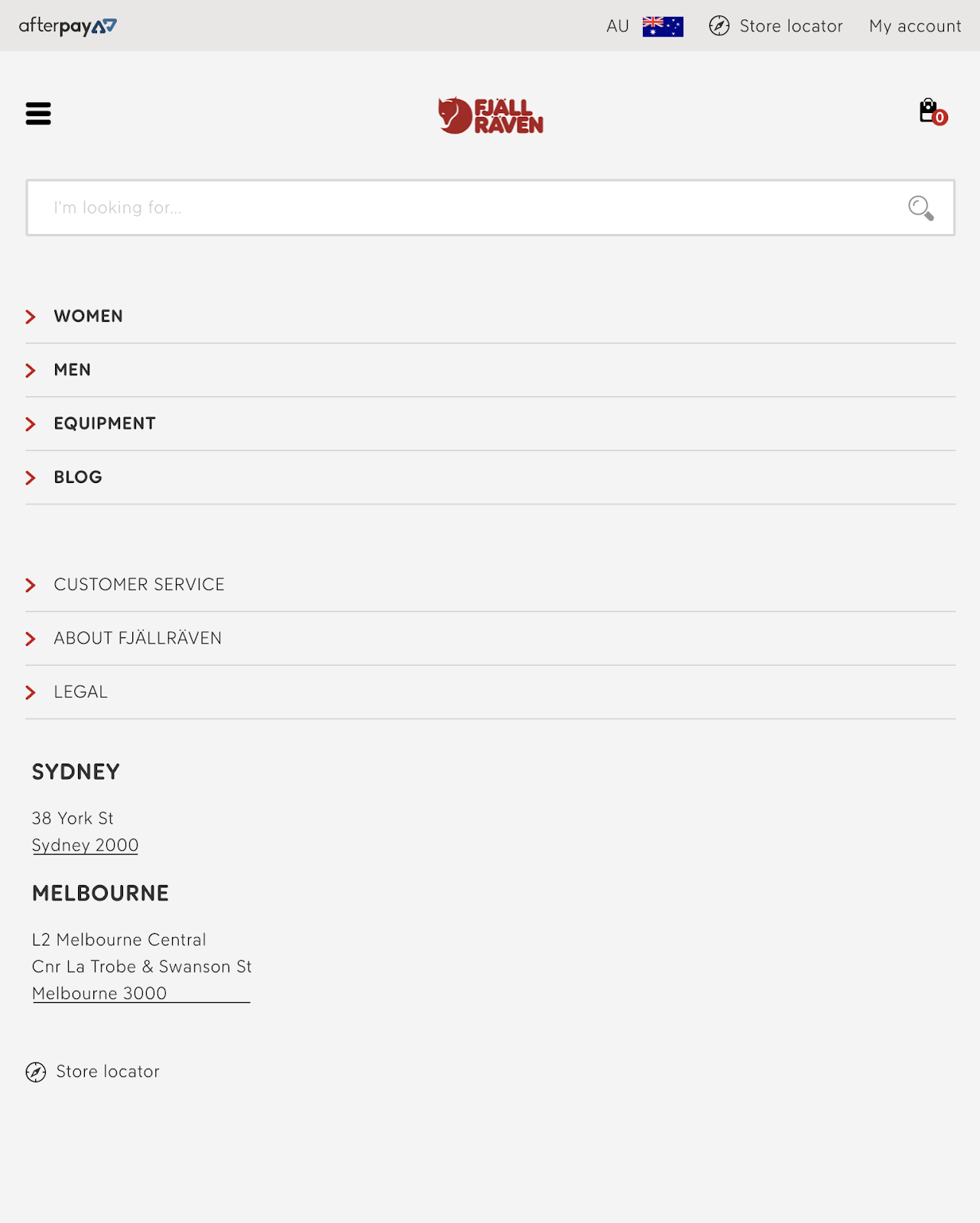
Desktop header
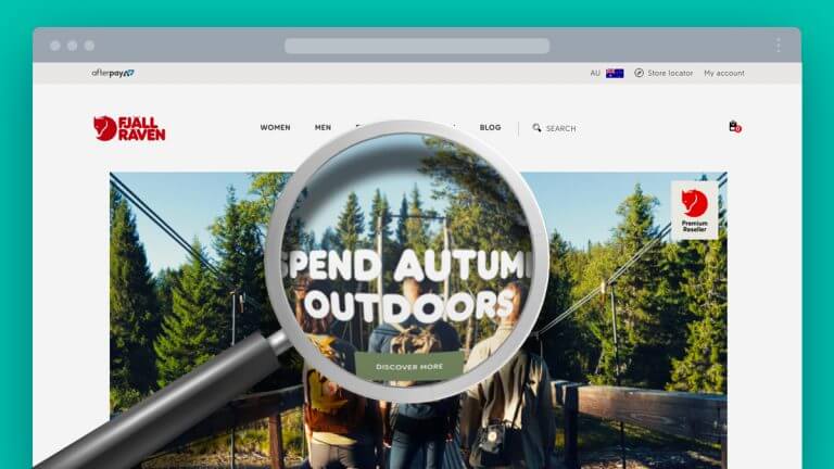
Existing desktop header.
Remove top strip
The top strip adds a lot of vertical space to the header that doesn’t need to be there. This can be condensed down by combining store and account elements into the menu space and removing the Afterpay logo. Store Locator and Country Icons can be made smaller as they are less important in the information hierarchy.
Afterpay and Zip logos can be moved to the footer, and are shown on the product pages where users will be purchasing, so it’s not vital that they show in the header at all times.
Add Kånken as top level menu item
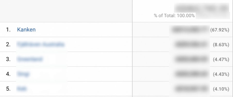
Kånken is by far the most popular product on the site. Kånken products make up just under 68% of all sales, and are the main terms that are searched for in the site search.
For this reason, it would be more beneficial and convenient for users if there was a direct menu item for Kånken products.
Mockup
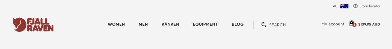
Proposed desktop header.
Mobile header & menu
With mobile and tablet users making up over 72% of website traffic, they still only contribute to 55.85% of all transactions. It’s imperative that the mobile experience provides the user with everything they need without moving onto a desktop device to complete the purchase. We see trends of up to 31% of conversions on desktop occurring after people interacted with ads on mobile.
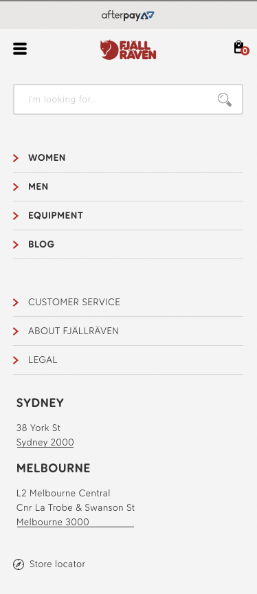
Existing mobile header & menu and tablet header & menu.
Change menu icon to close (X) icon when menu is open
Changing the menu icon to a close icon when the menu is open will help users differentiate between the open and closed state, as well as make it obvious they need to tap the icon again to close it.
Remove top strip
Just as in the desktop header, removing the top strip across mobile will free up wasted space and avoid distracting from the desired navigation.
Add Kånken as top level menu item
To keep the mobile menu consistent Kånken should be added as a top level menu item.
Add “See All X” sub menu items
In the mobile menu, tapping a top level menu item opens the sub menu and tapping it again closes the sub menu. This means that users cannot reach the top level collections (i.e. Women, Men, Equipment) from the mobile menu. To solve this problem, a “See All X” (eg. See All Women) sub menu item can be added to perform this function.
Add country and “My Account” links
The mobile menu doesn’t include all of the elements from the desktop header. The country icon and My Account link can be added. The Store locator link is currently at the very bottom of the menu and hard to find. This can be moved to somewhere more contextually relevant.
Add social media, payment options & shopping USPs
Users will often look in a mobile menu for information that is often found in the footer on the desktop view. Adding payment logos, social media and unique selling points (free shipping, 30 day returns) to the mobile menu increase relevance making this information easy to find. It also places them close by when we’ve taken away the top strip of the header.
Ensure full menu is visible
On some devices, the bottom of the menu is obstructed by the browser’s toolbar. This can be solved by adding some empty space to the bottom of the menu.
Mockup
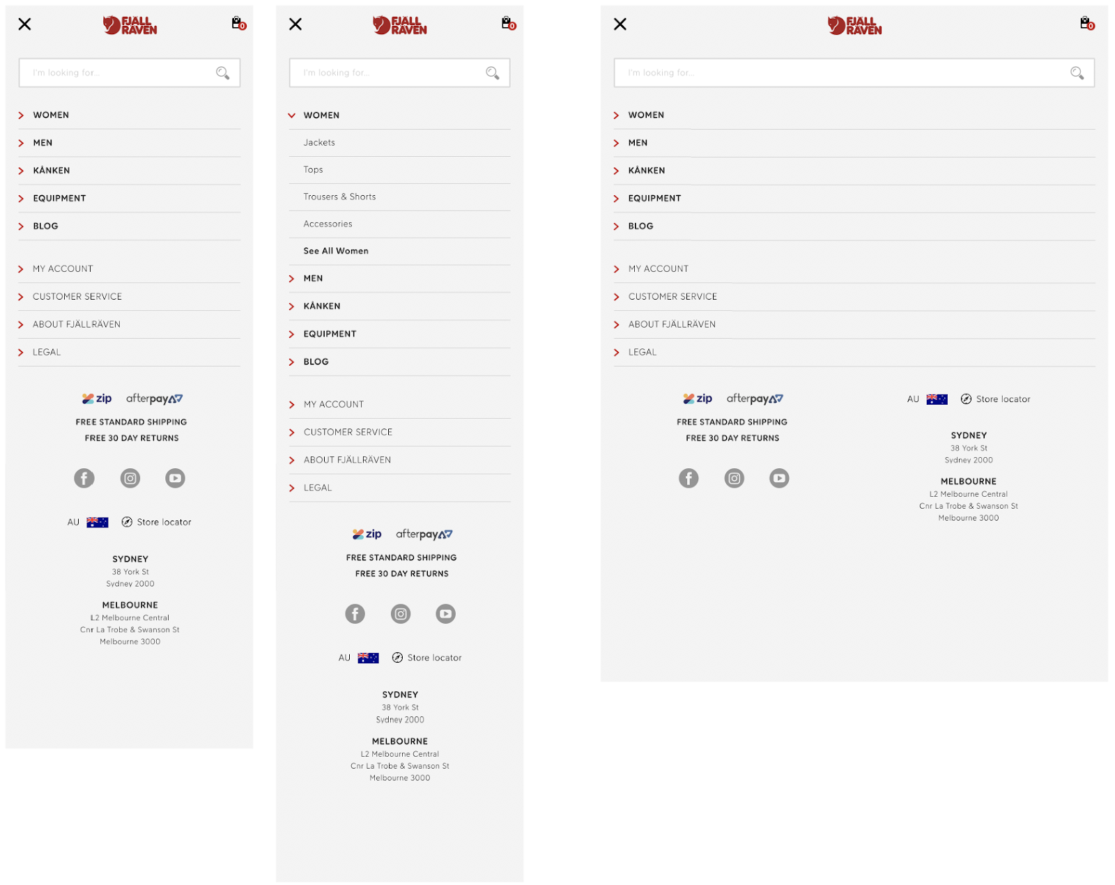
Proposed mobile menu & headers and tablet menu & header.
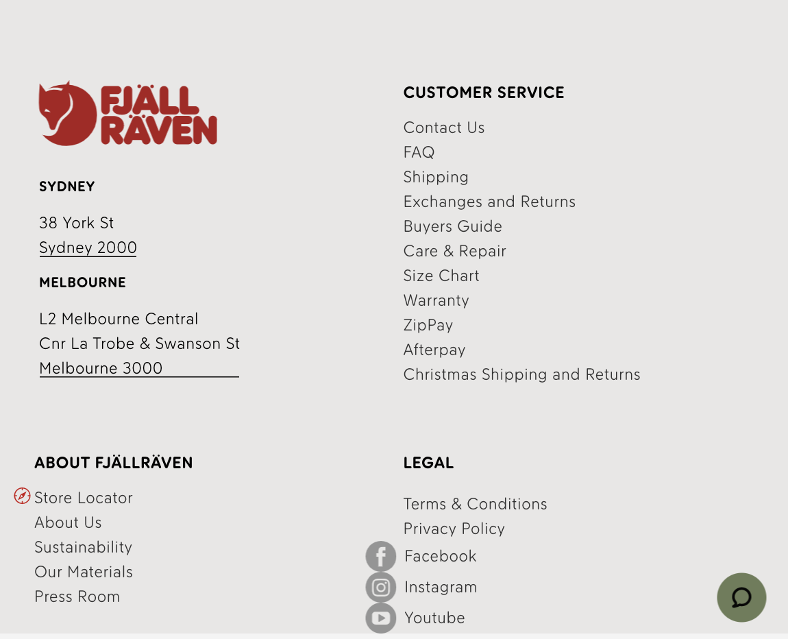
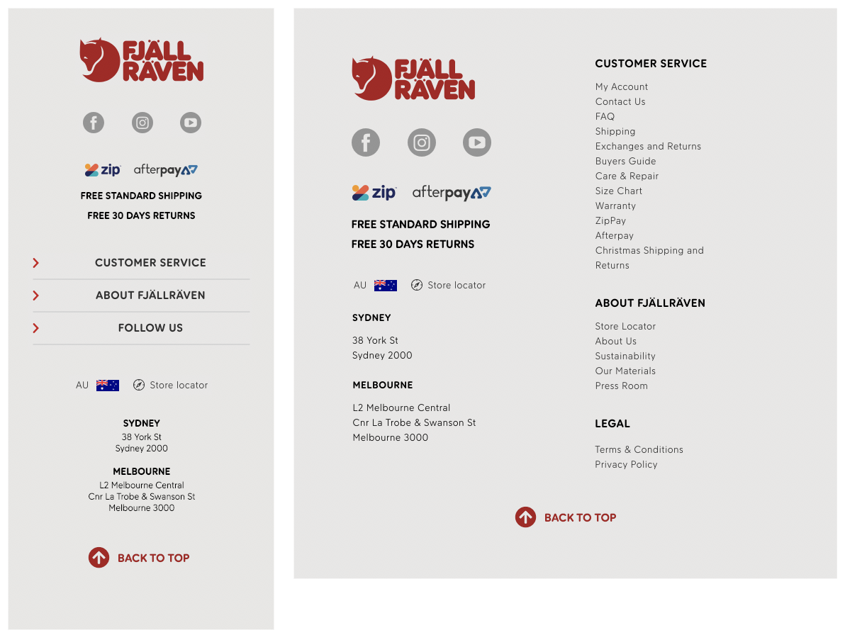
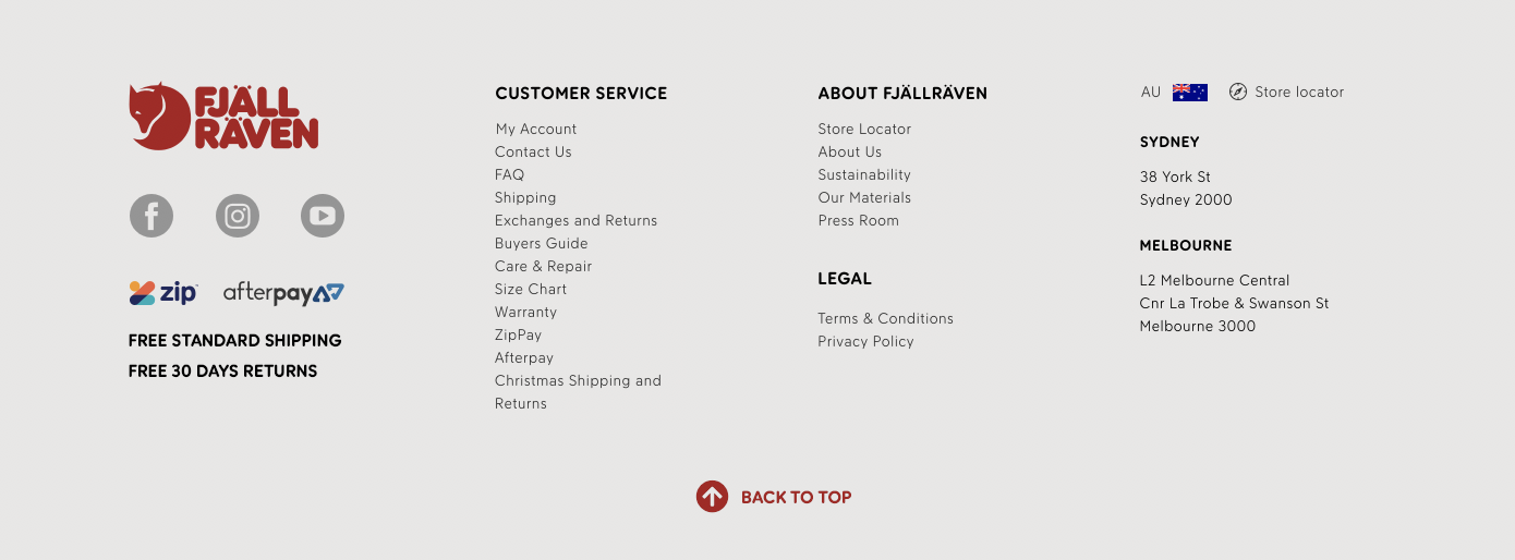
Footer


Existing footer on mobile & desktop.
Existing footer on tablet.
Add payment methods & USPs
Users often check the footer for payment methods and shipping/returns information, especially on desktop. Taking away the top strip in the header makes it more important to make sure this information is available.
Adjust formatting on tablet
The layout of the footer on tablet is unoptimised and could be confusing for the user. This can be solved by adjusting the layout as it transitions down to tablet size.
Add “Back to Top” Icon
Add a “Back to Top” icon that will scroll right back to the top of the page. This is especially handy for mobile users.
Mockup
Proposed mobile & tablet footers.
Proposed desktop footer.
Home
Pathways section
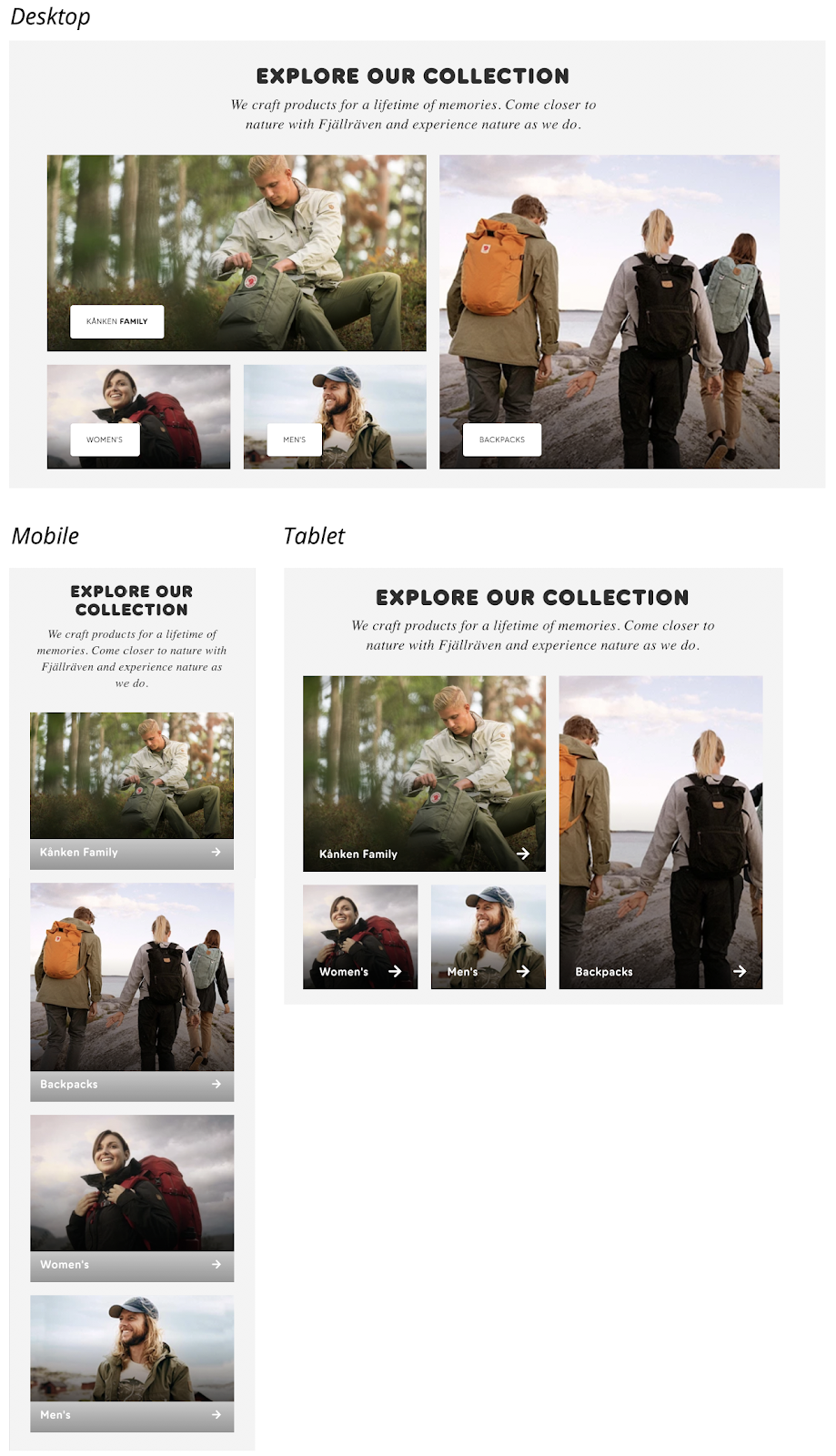
Existing pathways sections.
Make pathways section consistent across devices
The new pathways section is getting utilised very well.
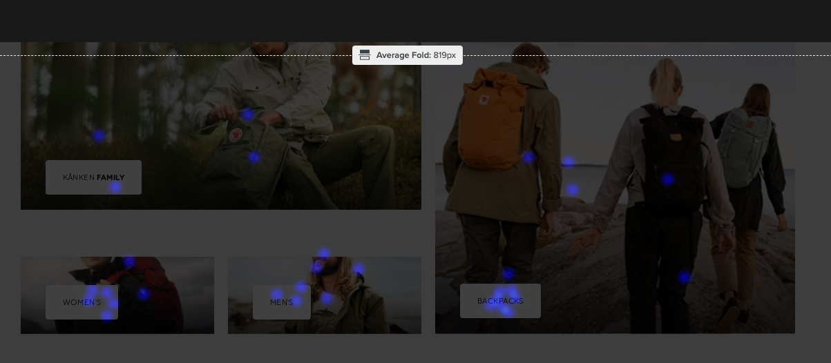
Unfortunately, this section changes styling between devices. Changing the styling to match the tablet size across all devices will provide a more consistent user experience.
Mockup
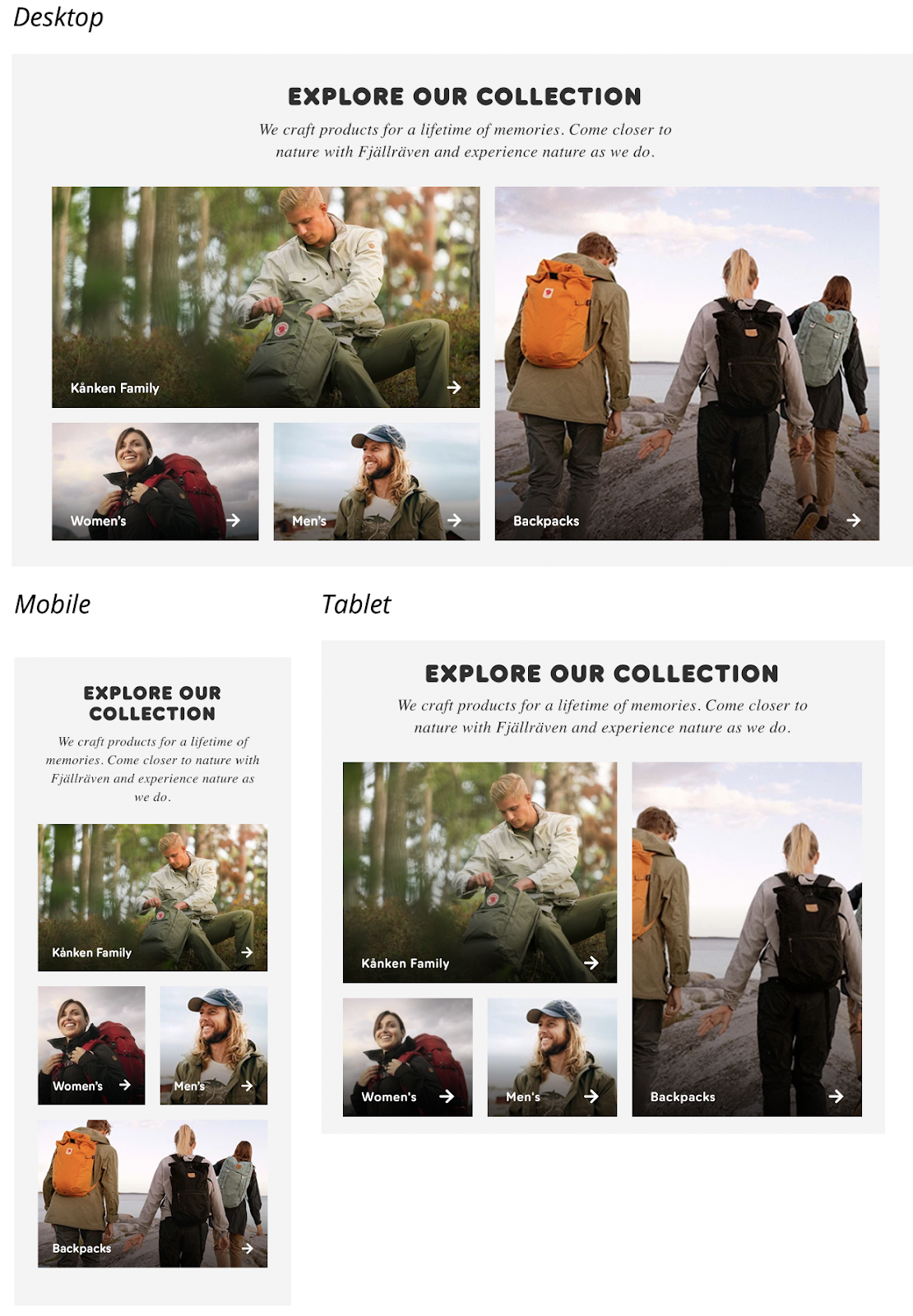
Proposed pathways sections for desktop.
Proposed pathways sections.
Note: Two column second row on mobile view.
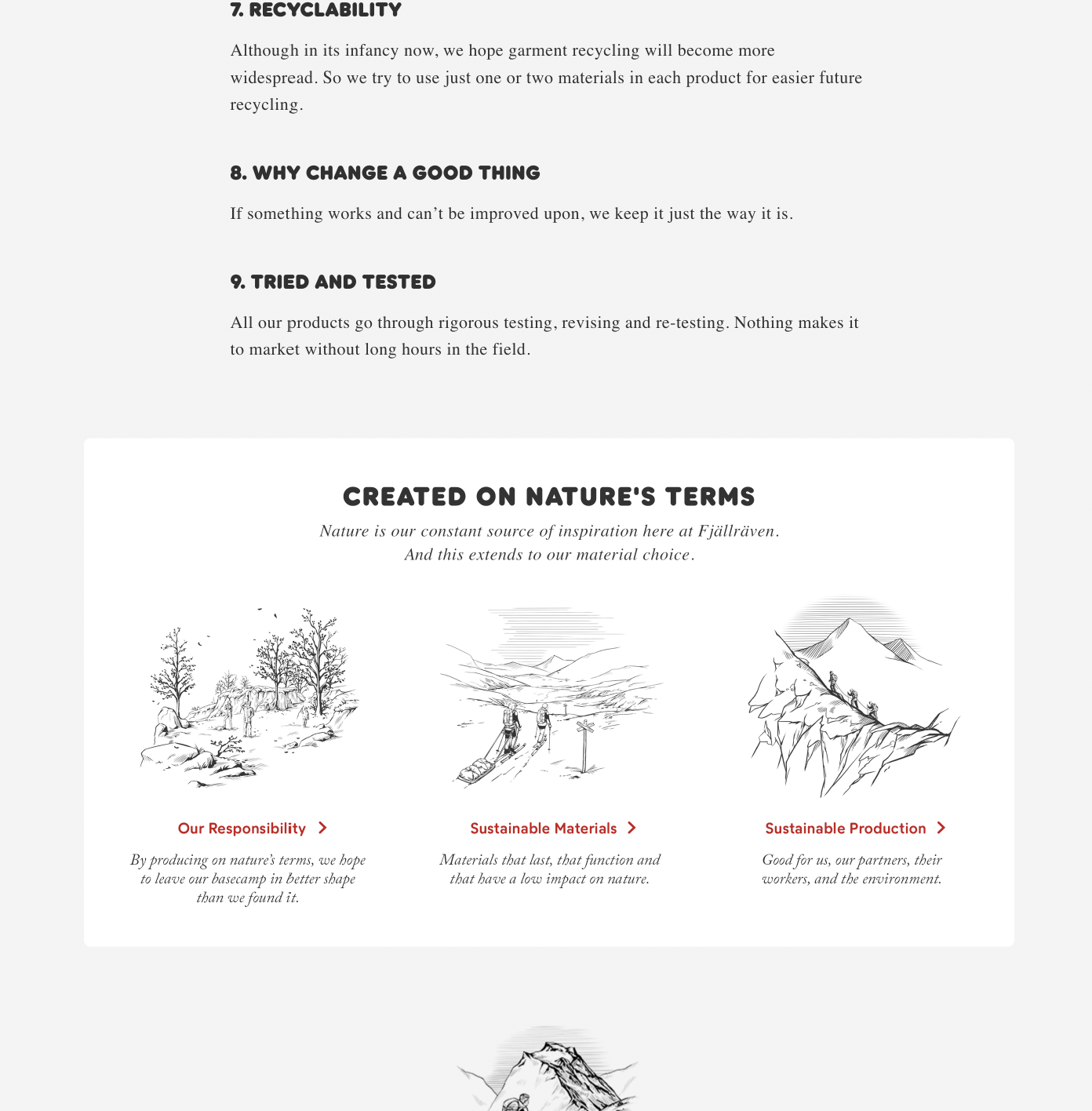
Sustainability section
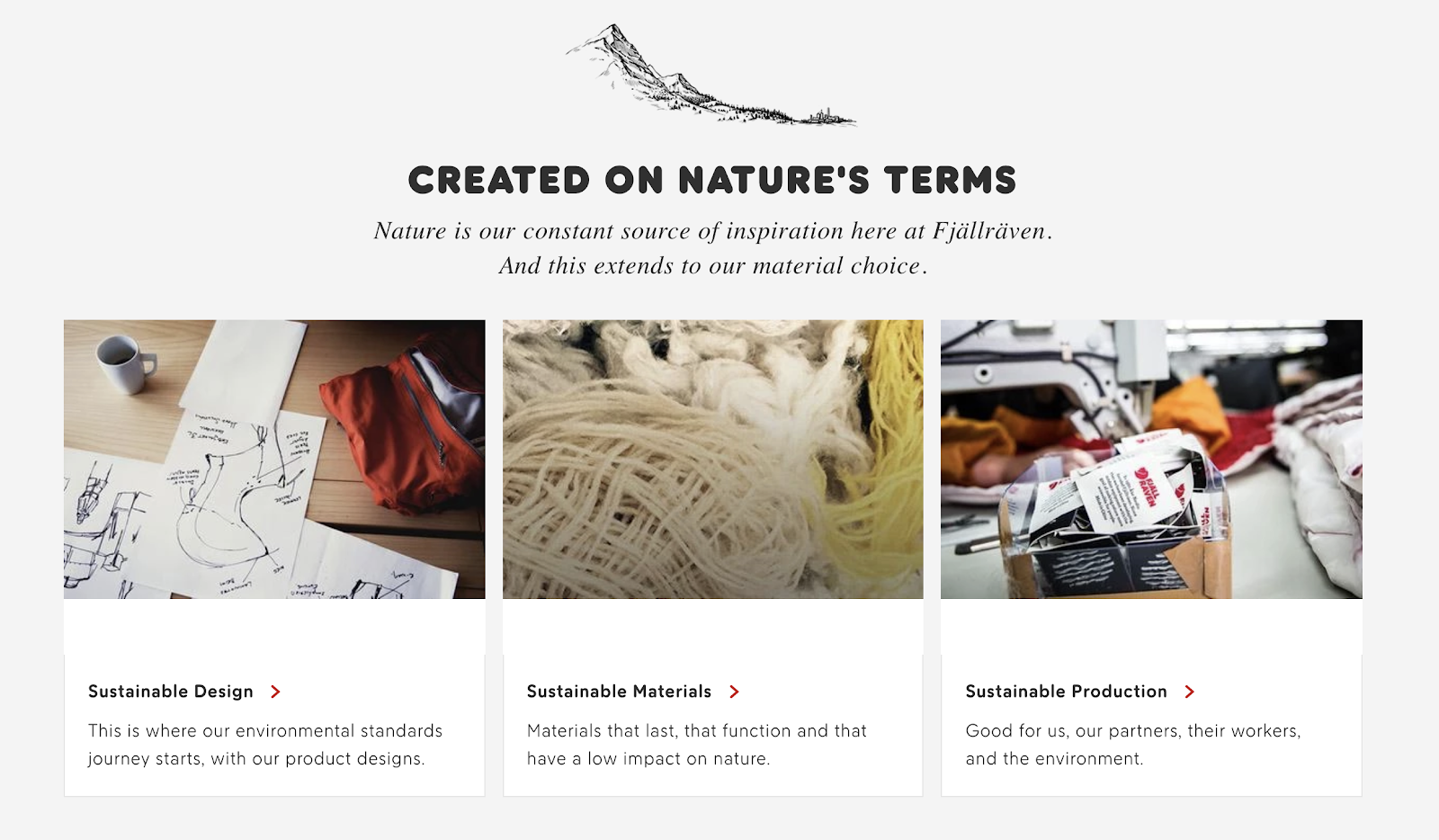
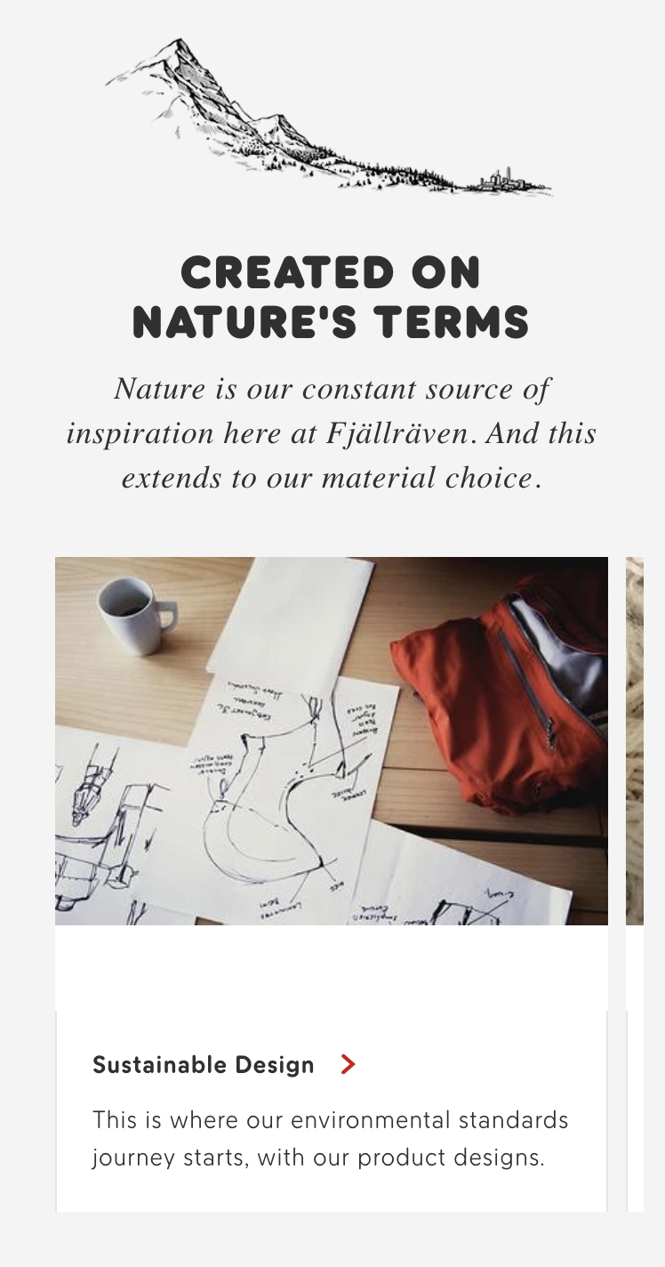
The new sustainability sections on desktop and mobile are also being used very well.
Present sustainability as USP
Sustainability is a big part of the Fjällräven brand and should be leveraged as a unique selling point (USP). On the home page, the sustainability section looks a little bland and not distinct from the links to collections below it. Making this section more prominent will help users find it and build up sustainability as a point of difference over competitors.
Mockup
In these mockups the Fjällräven sketch-style illustrations have been used as placeholders as an example of what could be used.
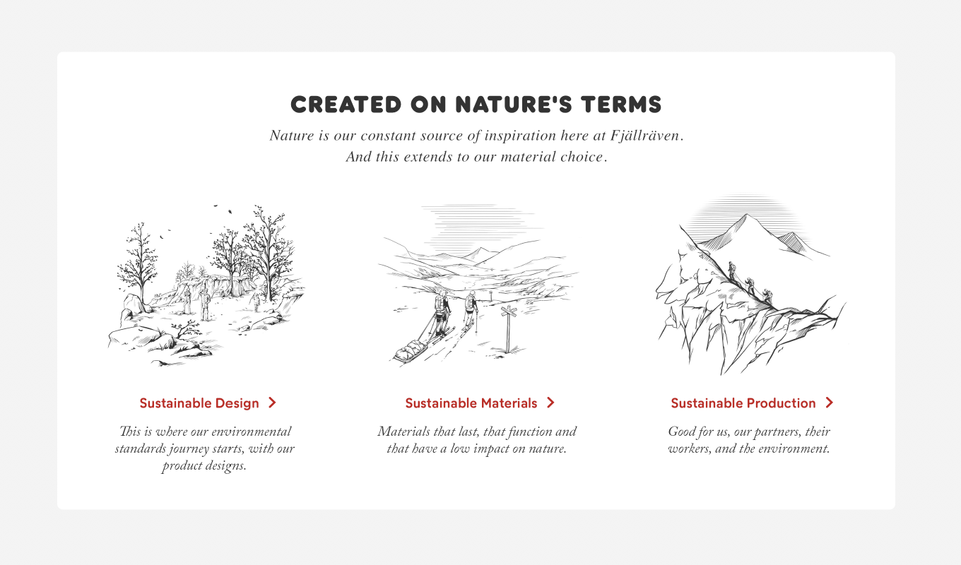
Proposed sustainability section on desktop
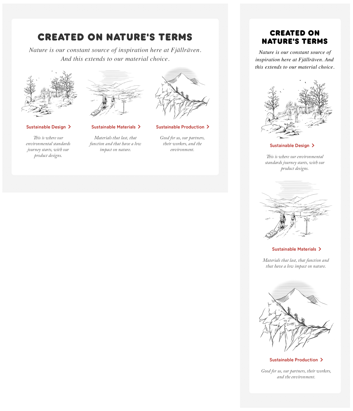
Proposed sustainability section on tablet and mobile
Search
Add search to mobile home
Search is hidden from the header on mobile, but is still accessible in the menu. For new visitors this might not be obvious, so including a search bar on the home page underneath the hero will help them find what they need.
Mockup
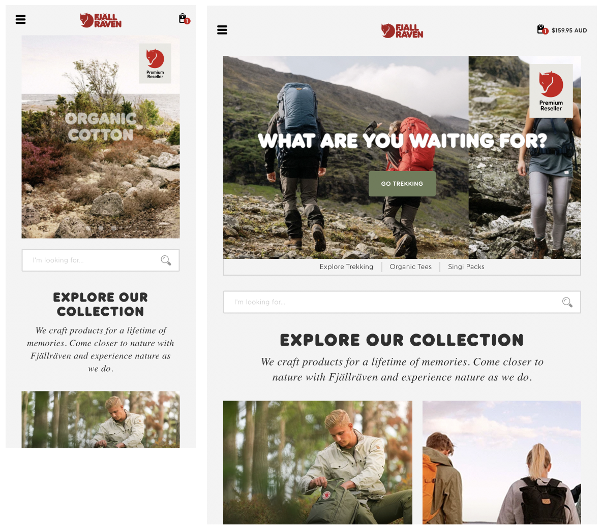
The proposed search field on mobile & tablet home
Search
Add predictive search
Adding predictive search helps users find what they need faster. Products are shown in a dropdown when the user starts typing with a visual representation of the product.
Mockup
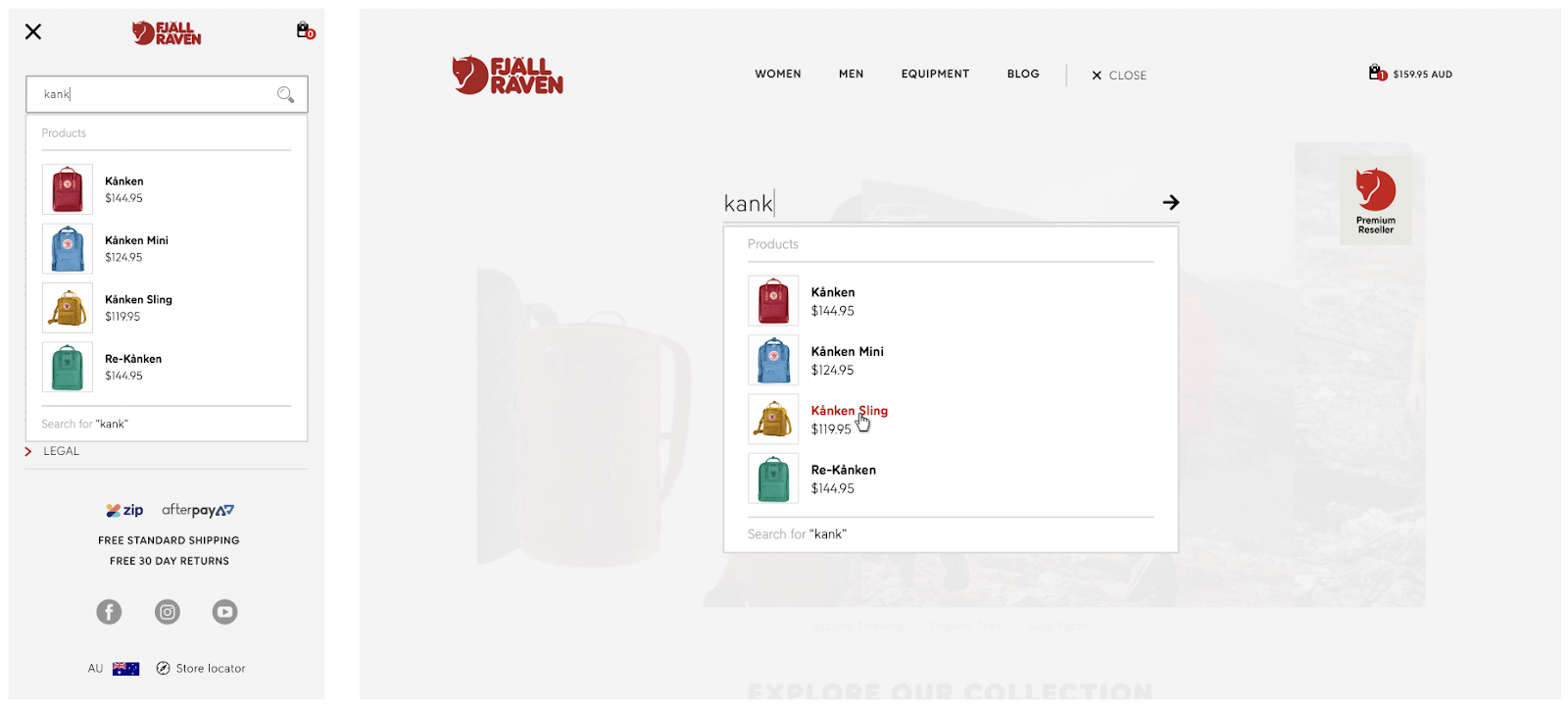
Proposed predictive search on mobile and desktop
Sustainability pages
Sustainability pathways
On the current sustainability sub-pages, there are no pathways to follow once the user reaches the bottom of the content. Adding pathways between all the sub-pages will give users an action to perform once they are finished reading and help guide them through the sustainability sections as a whole.
These can use the same styling as the sustainability section on home for consistency, but replace the currently viewed page with a link to the top level sustainability page.
Mockup
This example is the Sustainable Design page. We’ll use the same layout as the home page, but replace “Sustainable Design” with “Our Responsibility” which will lead to the top level sustainability page.
Proposed pathways on “Sustainable Design” desktop.
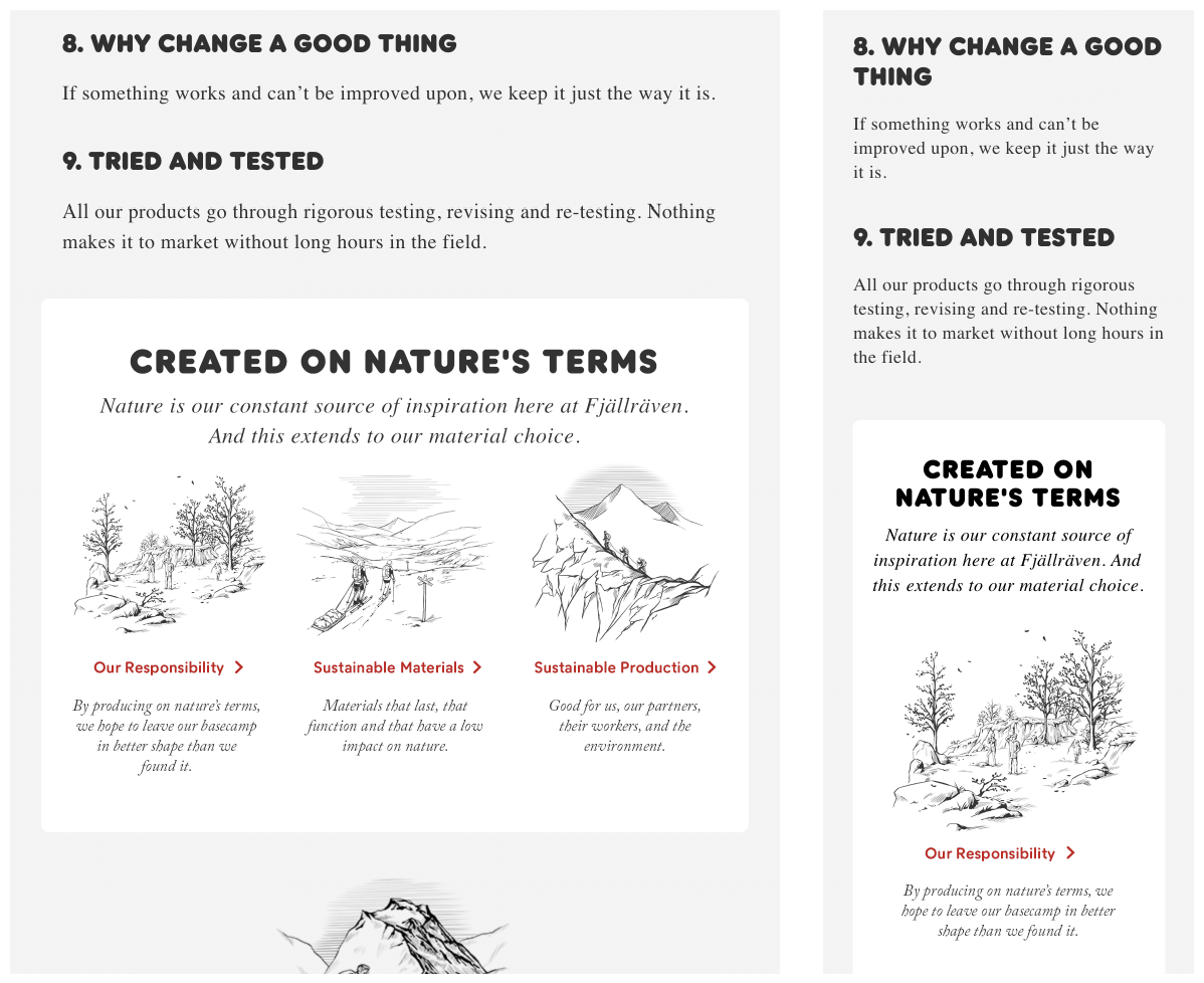
Proposed pathways on “Sustainable Design” tablet and mobile.
Collection pages
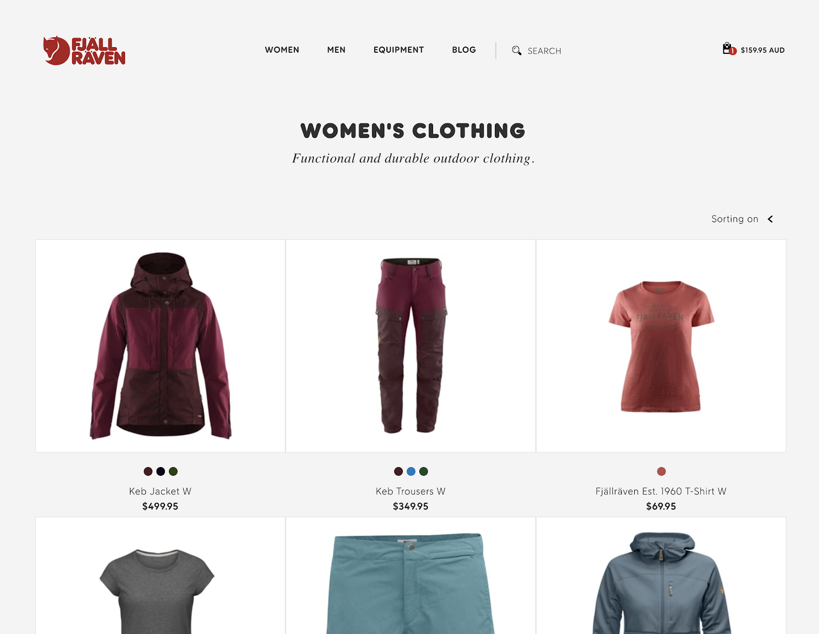
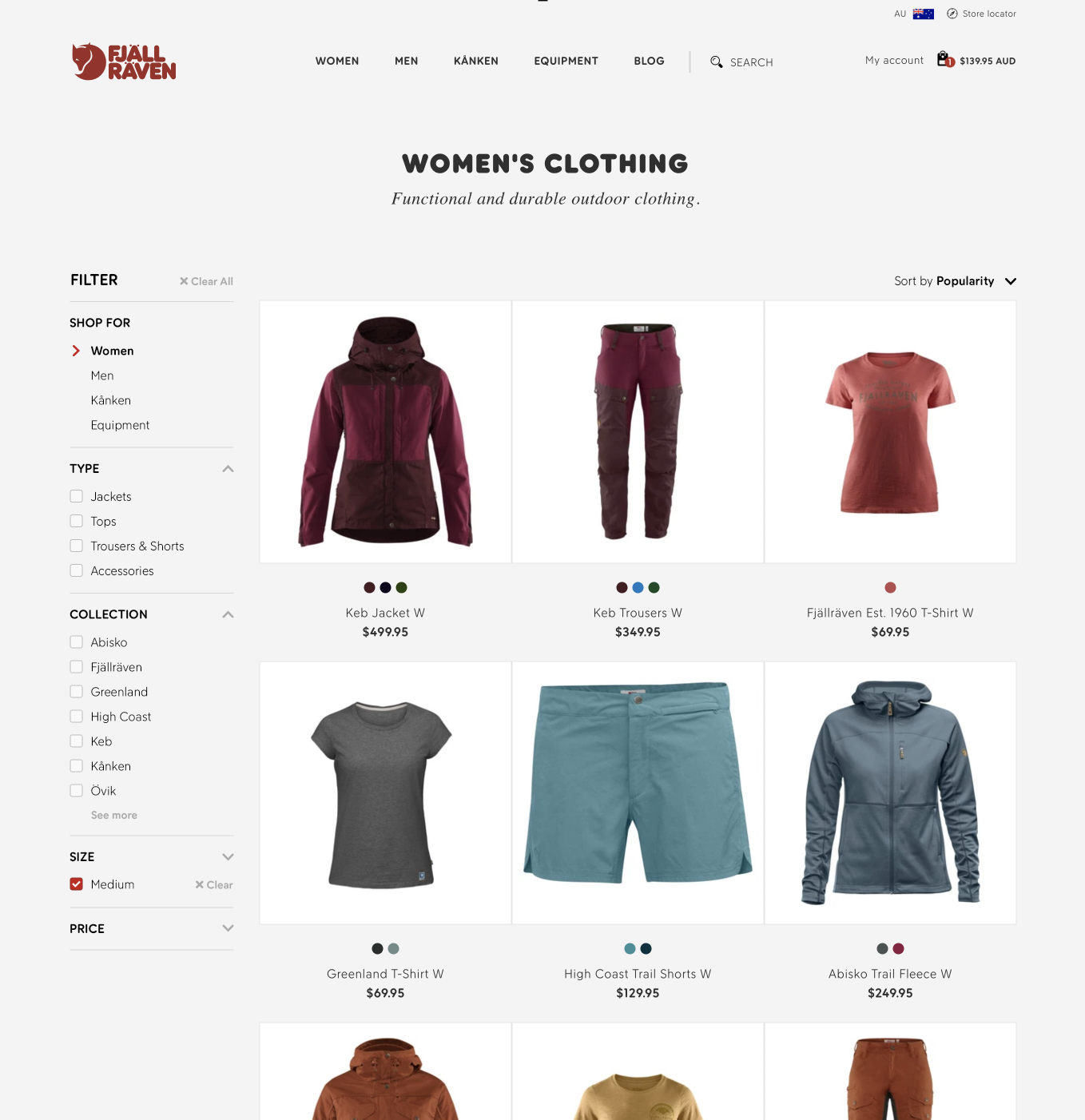
Existing collection page on desktop.
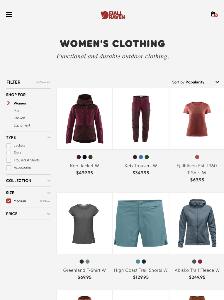
Add Filters
There is good traffic to collection pages, including from the new pathways section on the homepage. Once users get to a collection page however, they have no way to filter through results.
Adding a full filter menu including top level categories would enable users to quickly browse all products, and easily refine their search. Filters can be added for just about anything including collection, materials, size, price and more.
Change sorting to dropdown menu
The sorting menu takes up a whole column of product on desktop and tablet. On mobile it covers the products. Changing this to a simple dropdown menu would bring it inline with expected behaviour.
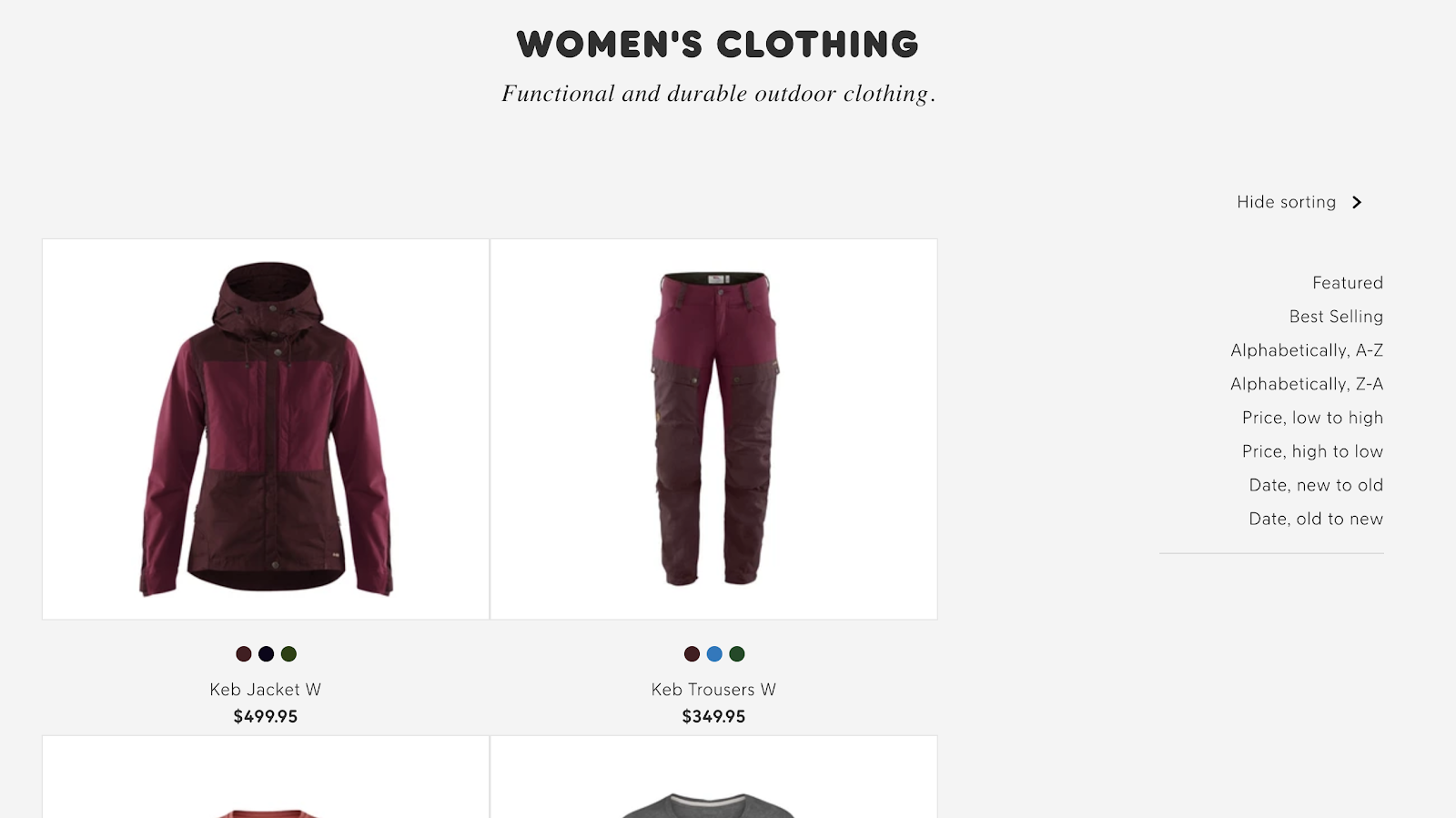
Sorting menu on desktop.
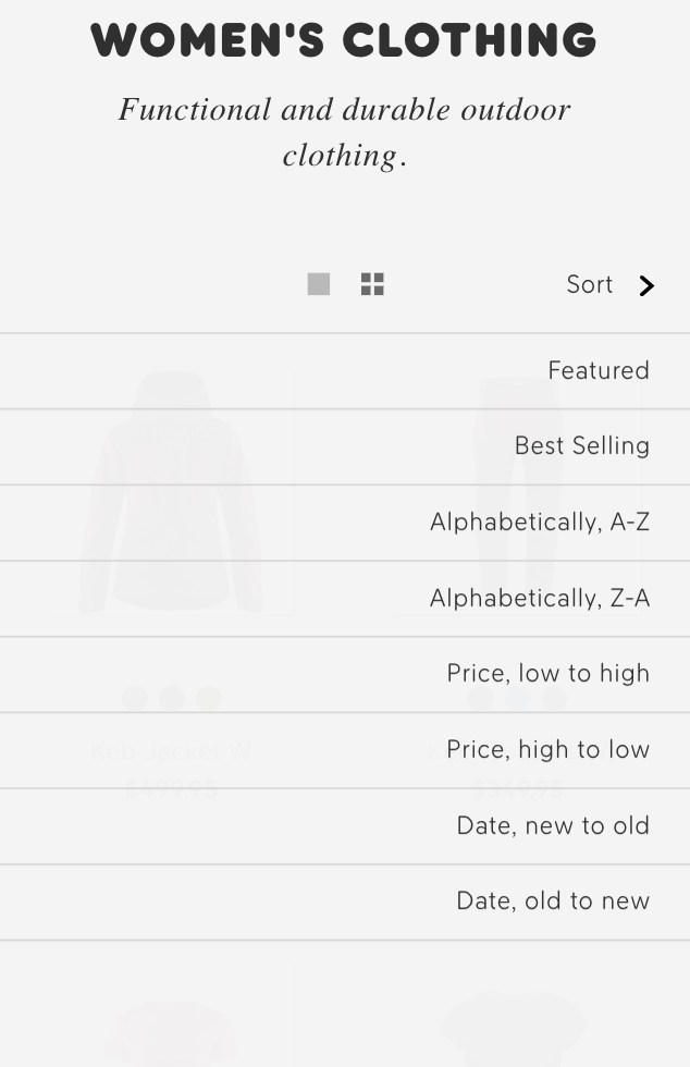
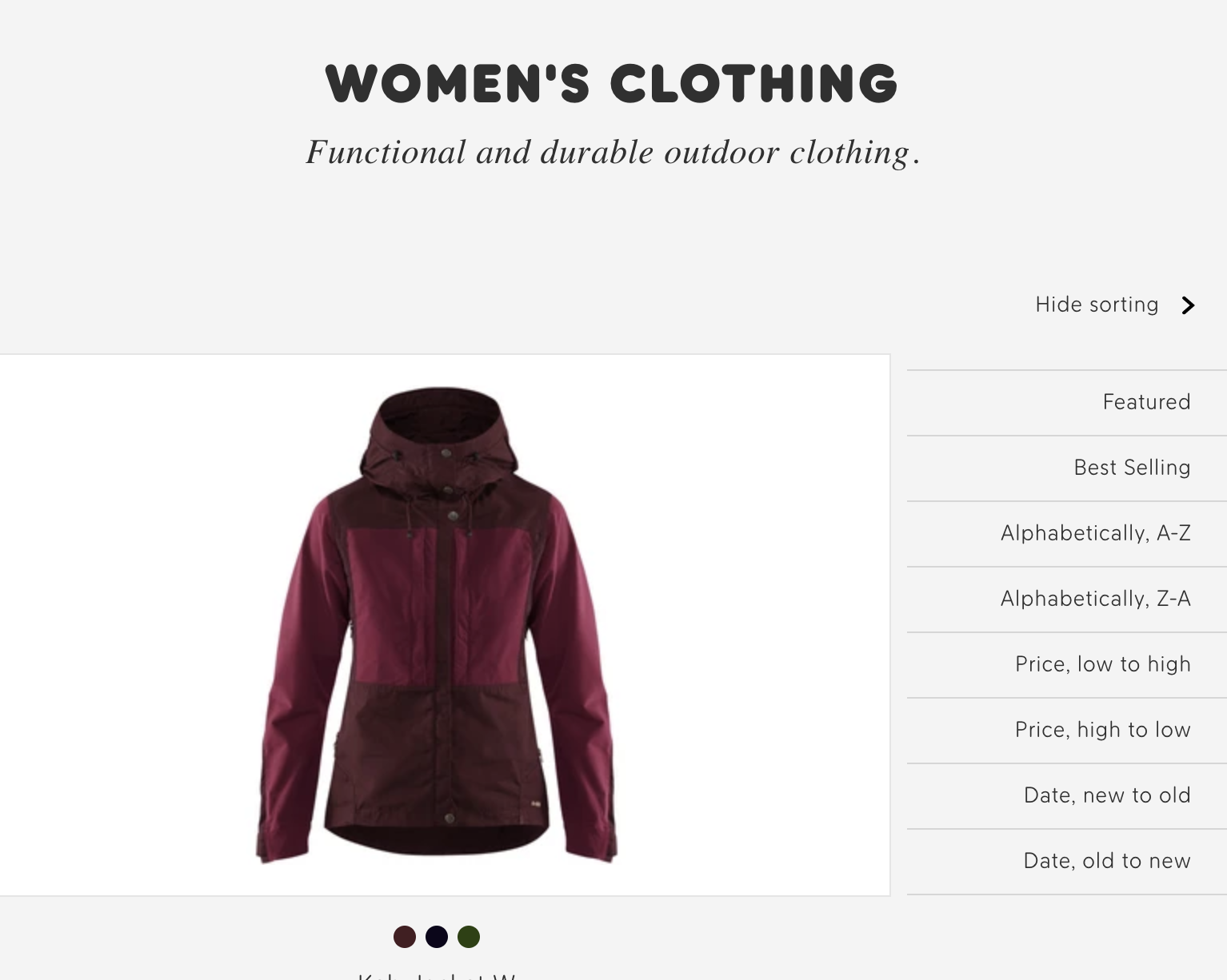
Sorting menu on mobile and tablet.
Mockups
Proposed desktop collections filtering.
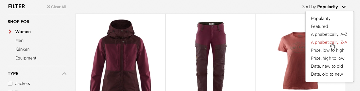
Proposed sort dropdown menu.
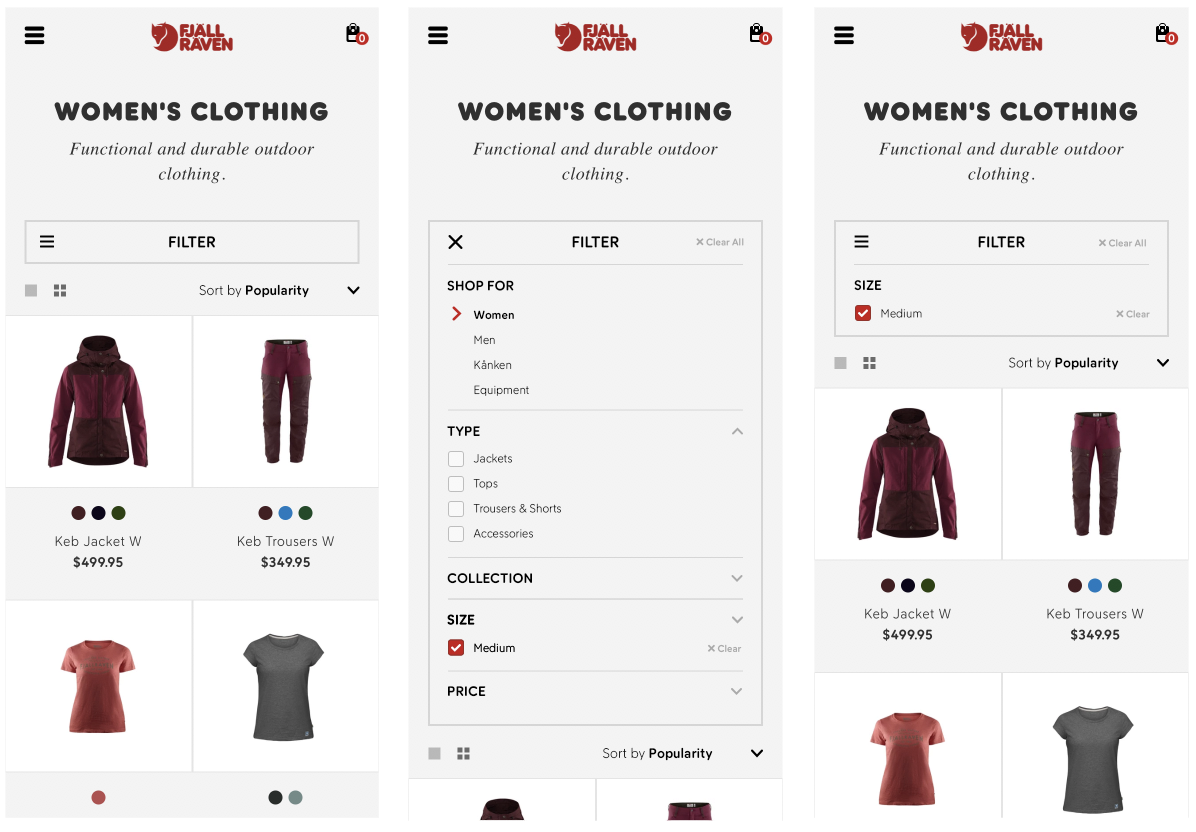
Proposed mobile filtering. Left is the default state, middle is the filter menu open, and right shows the filter menu closed while a filter is active.
Proposed tablet filtering.
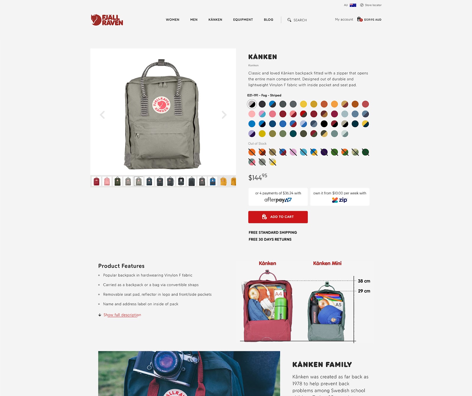
Product pages
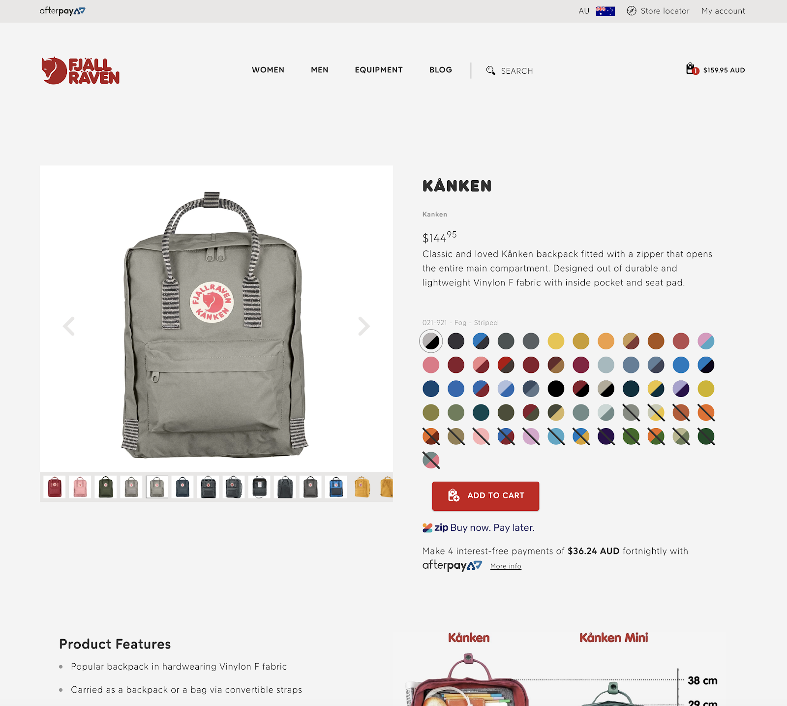
Existing desktop product page.
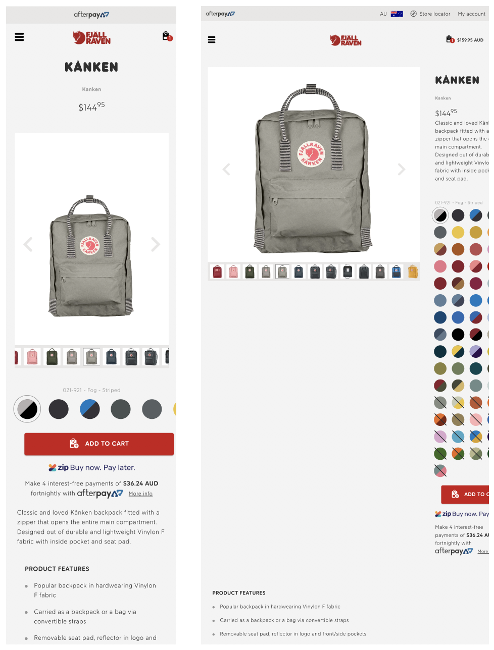
Existing mobile & tablet product pages.
Fix tablet layout
The current tablet layout for product pages is pretty much unusable. This should be improved as a priority. As per the suggested changes to tablet layouts on other pages, this should use the same layout as on desktop but use the font sizes from mobile.
Improve price to cart flow
The price is currently shown right under the product name. Grouping price information together with the payment options right above the Add to Cart button helps users make an informed decision and is less likely to abandon the cart. More prominent finance options with the prices shown help drive down the perceived investment and also aligns with our learnings from the product page A/B testing.
Putting the price information below the customisation options can also help increase conversions through commitment bias (where the user has already invested time into customising the item so feels a stronger bias toward buying).
Add shipping and returns USPs
To further build trust and reduce friction, the “Free standard shipping” and “Free 30 day returns” USPs should be added permanently again as per the learnings from our product page A/B test outcomes. The best place to put them is right below the Add to Cart button – where the user’s decision to buy happens.
Fix mobile product image
The current mobile layout has the product image taking up a lot of screen real estate but showing a lot of empty space. This can be condensed considerably pulling more content up with it. The image thumbnails can also be made more mobile swipe-friendly.
Kånken specific changes
As mentioned previously, Kånken is by far the best selling product on the site. It also has the most colour options, with 61 options currently available. This number of options can become unwieldy for users – especially on smaller devices.
In the mockups below we have included all of the previous product page changes, as well as two different options for displaying the colour options on Kånken, which should be conducted via more A/B testing.
Option 1
In this option an additional “Colour Group” functionality is added. Colours are grouped together into hues or tones (red, green, orange & yellow, dark colours etc) and can also be grouped in other ways. In these examples, a “Bestsellers” group, Doutone group and “All” group have been used.
Mobile
On mobile this allows the user to select a colour group and see how many colours will be loaded into the slider below. This keeps the colour slider easier to manage rather than swiping through 61 options, though the option is still there if the user wants it.
The whole product image and colour customisation will be visible on the screen without scrolling on most newer mobile devices.
To provide some user feedback on how long the sliders are, scroll bars should be used on all sliders. These scroll bars would operate just like the existing website (on the colour slider), only appearing when needed.
Desktop
On desktop we’ll show all the colours instead of a slider, but we have the opportunity to separate in-stock and out-of-stock. We can load the whole set of colours by default to show the full range to users, but this will clutter the page and push the Add to Cart further down. Alternatively, we can show just the Bestsellers by default keeping the page tight but hiding the options away under an additional click. This would be another great example of an A/B test scenario.
Tablet
Using the same layout as desktop but with our mobile sizing and functionality (sliding colours) keeps the tablet functionality tight.
Option 2
Option 2 uses simpler functionality than option 1, but hides more away on mobile.
Mobile
On mobile the currently selected colour is shown above the Add to Cart button, which is helpful for the user. There is a “Choose Colour” option which when tapped will open a modal window containing a product preview and all the colours. The user can still choose a colour using the product thumbnails if they want to.
The benefit of presenting the colour options in a modal window, is that they are all right there on the screen with no distractions. The user can easily tap away seeing what all the colours look like before making a decision. The colours can also be separated into in stock and out of stock.
Desktop & Tablet
On desktop and tablet we have room to show all the colour options alongside the product image, so the modal window isn’t needed.
Mockups
Option 1
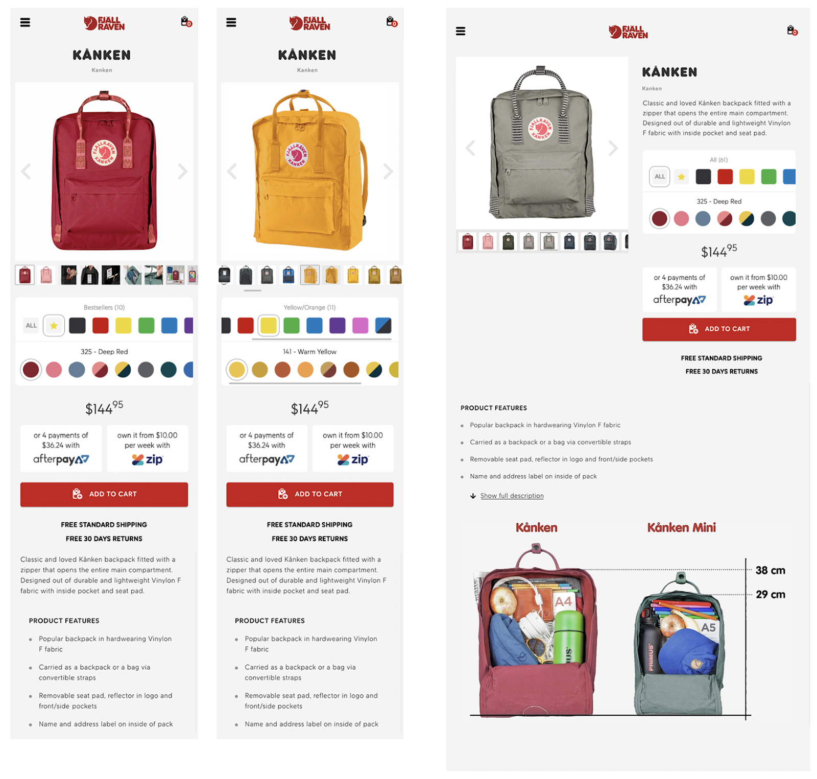
Proposed mobile and tablet Kånken pages.
Left shows mobile in default state with “Bestsellers” colour group.
Middle shows a selected colour group and scroll bars on sliders.
Right shows tablet layout.
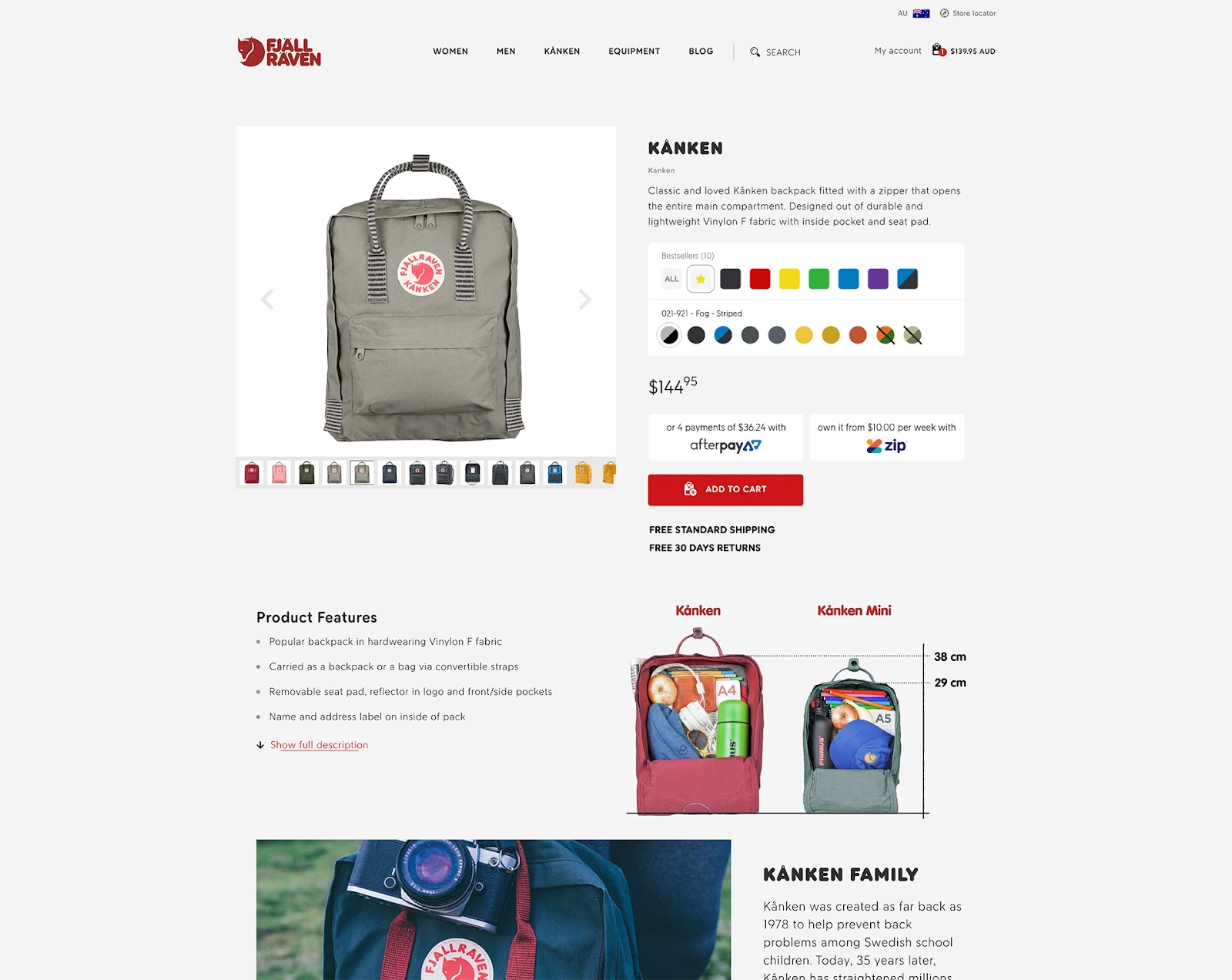
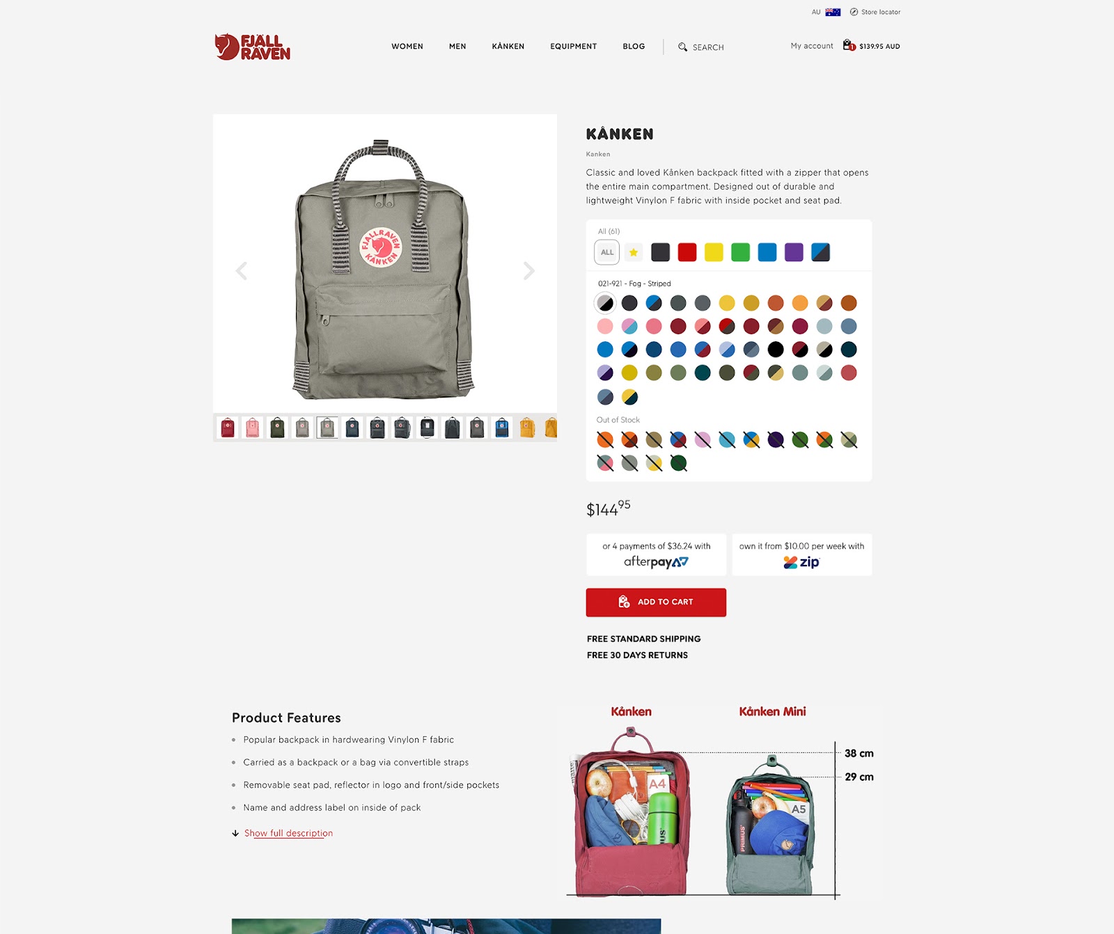
Proposed desktop Kånken pages. Top shows “Bestsellers” group. Bottom shows all colours.
Option 2
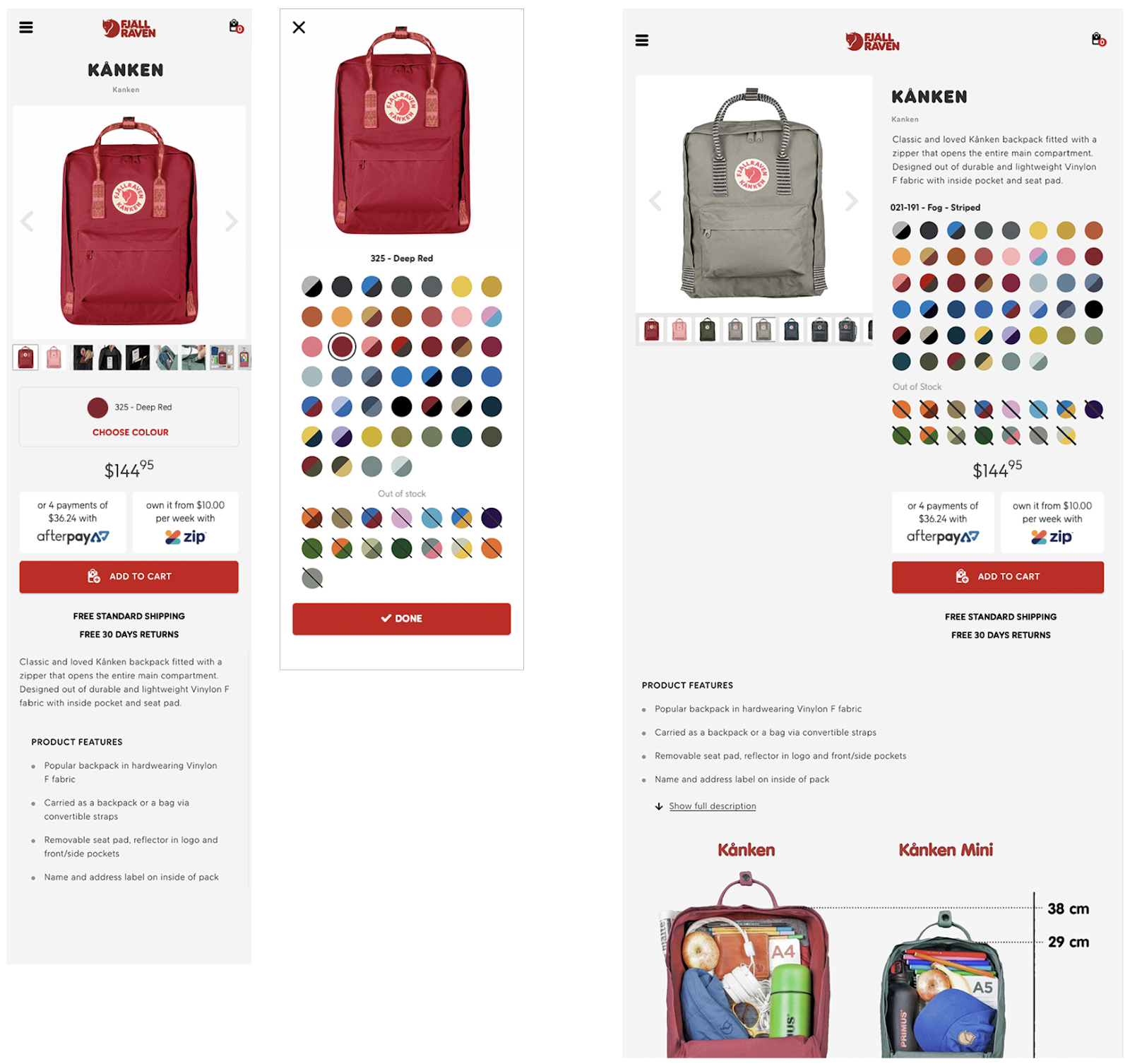
Proposed mobile and tablet Kånken pages.
Left shows mobile in default state.
Middle shows the modal colour picker.
Right shows tablet layout.
UX and CRO audits are an amazing place to start with your eCommerce optimisation journey. Check out the Fjällräven UX/CRO and growth optimisation results we achieved.
Are you ready to enhance user experience on your site?