On the 21st of September, Apple unveiled their brand new flagship phone – iPhone XS. Available in two sizes, with the same edge-to-edge display as the previous iPhone X, Apple has made another leap in mobile phone technology, bundling new features and technology into the same sized handsets as the last year. Alongside the XS phones, Apple also released the lower-cost XR model, which still sports the super quick A12 processor and exceptional new wide-angle angle lens of its higher-end siblings.
That’s stuff you can read about on almost every new site. Let’s talk websites instead: Apple have launched a new splash page to go with the new iPhone and it’s pretty great.
Between the thousands of hours invested per year, and the likely infinite budget, these launch pages always have one (or more!) feature that impress shoppers and developers alike. Each annual product cycle tends to raise the bar and reshape what’s in vogue. I’ll share a few of the most interesting techniques below.
Let’s pull apart their wild new launch page section-by-section and see how this thing works.
Quick note: This article is going to be a little more technical than most posts on this site, but I’ll try my best to filter it down to as little jargon as possible.
Heroes
First up, let’s look at the top-most portion of the page. On desktop, the user is prompted to scroll vertically to read the headline, with the text copy fading in as we scroll. The view from a mobile device looks a little different – the hero images themselves rotate 90°.
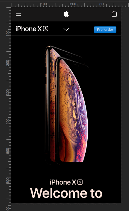
This is a neat effect achieved with a really standard web technique wherein the browser is asked a simple query – “what media is being displayed?”. The site responds with a different image depending on the viewport size. This pattern is used on pretty much every other image on the site – the browser gets higher-res versions of images on large (or Retina) screens, and entirely different versions on mobile devices.
Box of Video
The second section of the site features a full-screen background, large heading and a string of text. Interestingly, the entire section is a clickable link – not just the text or button. This is good practice as it’s an easy target for a thumb or index finger. When pressed or clicked, the video is opened in a full-screen pop-over. The entire page becomes the video, rather than having the site try to keep its current look. Much more room to see & hear Jony Ive gush about stainless steel.
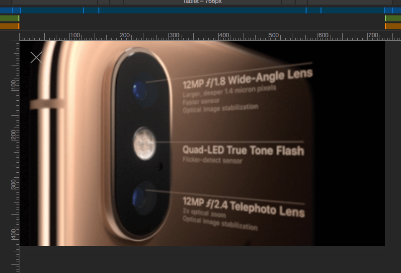
Additionally, this is one of the only places a traditional <img> tag is used to place an image on the screen – every other image is a background applied to another element, such as a <figure> or a regular <div> tag.
Attention Getter
This big chunk of text was, oddly, one of the first things we’d noticed. It’s Apple’s standard San Francisco font, displayed at various sizes, depending on viewport size. It’s sized in such a way that it’s always dominating the screen, but is very legible.
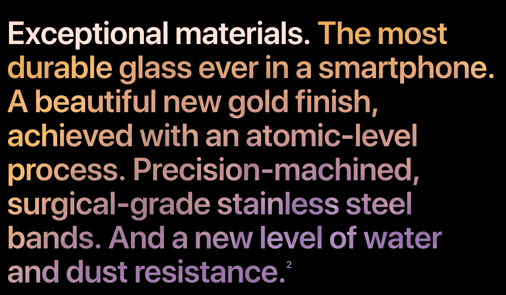
The colour is … texture? How does that work?
After digging into the page a little, we found that there’s a clever trick at play. The text itself is transparent, and the black box surrounding it is ‘clipped out’, allowing the background texture to show through. It’s like making a stencil, essentially. The effect is then nullified in the first part – it’s simply set to an off-white colour for contrast. Keen readers can see this effect recreated with an animation here. The same textured text effect is used a few more times on the site, with different graphics lending a unique colour each time.
Animation Begins
This third section is where stuff begins to move. This page uses what’s known as an Intersection Observer, which checks to see whether elements are within the viewport (or, simply put, visible on screen). This observer can then be used to do any number of functions – on this page, it’s mostly used to track scroll distance to begin and end animations.
Animation in this section is based on the users’ scroll amount – meaning that the further you scroll, the further along the animation is moved. That’s why you’re able to ‘rewind’ the page. The properties that are affected here are the opacity – how transparent any element it is – and the “transformation” which simply means stuff gets shoved either left/right or up/down.
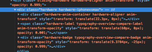
The transform: translate() property is the relevant part here. The users’ scrolling is read and used in a calculation to move these iPhone graphics left and right at various thresholds. Opacity is also setup in an interesting way – a value of 1 (fully opaque) or 0 (fully transparent) would typically be used here, but Apple have stopped short of both. A value of 0.999 is almost entirely opaque – only 0.001% transparent. It’s hard to say why this happens – it’d be very simply to round up or down here. It may be due to a rounding error, or for some other purpose we’re not privy to.
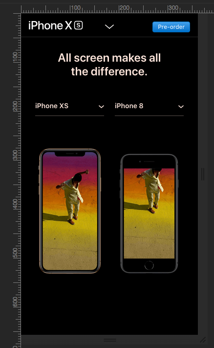
On a mobile display, this entire section is replaced by a side-by-side display of the phones, with a select dropdown to pick which to compare. This is a smart choice, as there’s not enough room to show the animation or the three sizes side-by-side. This is a great example of the sort of compromises we can make on mobile displays. It’s just as useful, but more suited to the way it’s displayed.
Animation Continues
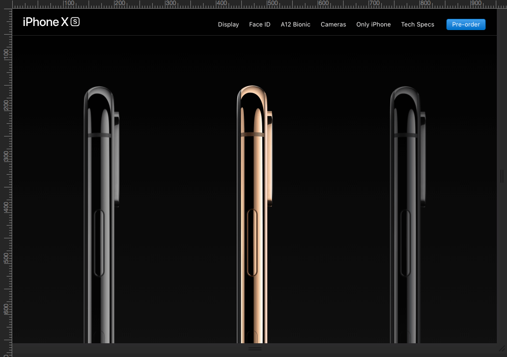
This three-across display of the models – in the code it’s identified as “hardware aligner” show the three colour options of the new handset. As above, it reads the scroll of the page (it’s a very, very long page) and translates that into animating the position and opacity of elements. Also as above, it is simply turned off on mobile. What sets it apart is the text that appears as you scroll:
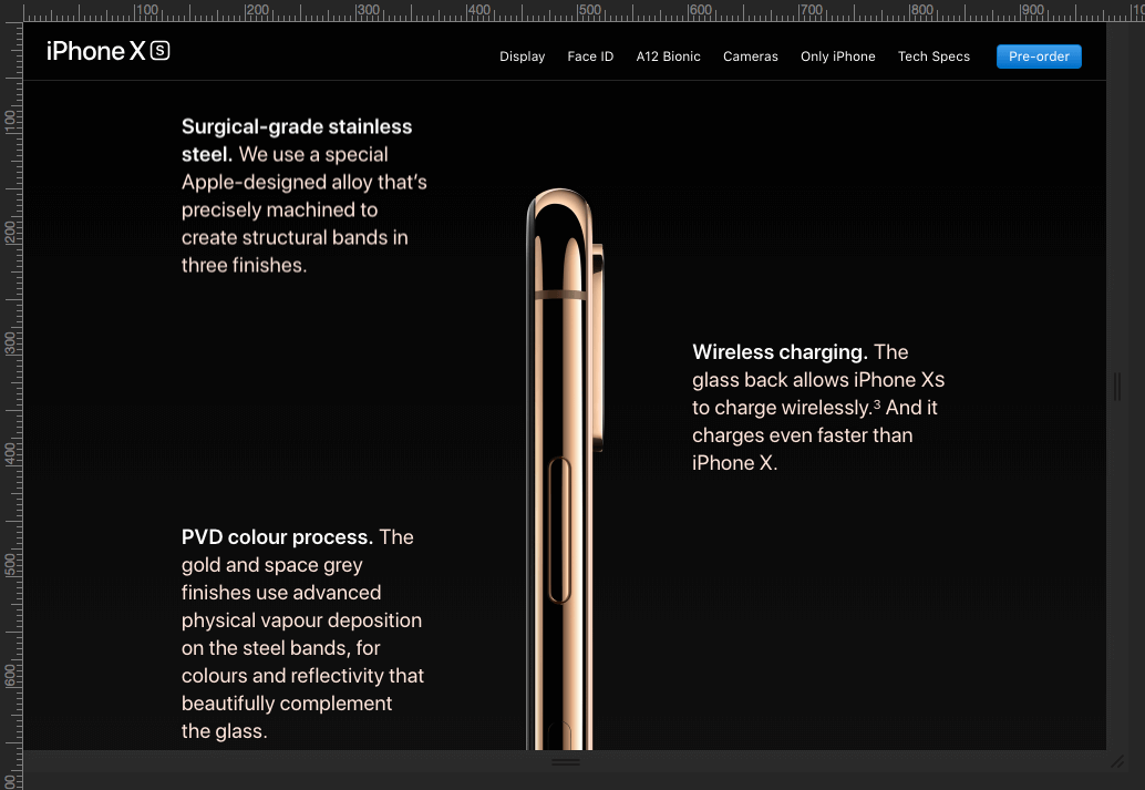
The text boxes have a neat, almost invisible animation – they don’t just linearly move from one position to another. There’s a sense of deceleration as you scroll, the paragraphs ease into position. This is a nice technique, which we’re sure to see emulated on other sites.
… And Continues
This is where stuff gets really complicated. There’s really three distinct parts to the next section. A full-screen image of an iPhone moves upwards and is scaled up simultaneously – it’s a fake-out to make it seem like it’s zooming in. After a little more scrolling (remember, this page is very tall) the next part begins.
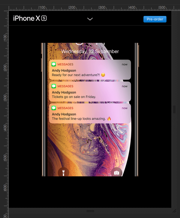
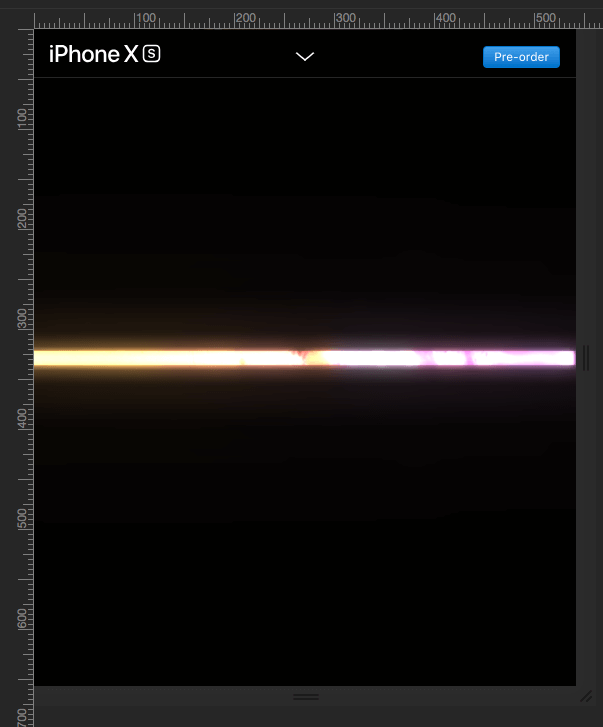
The full-screen image has this letterboxing effect, as if the power on an old CRT monitor has been switched off. If you scroll very, very carefully, you’re able to spot the moment when the image is replaced with a version that’s more saturated, and has a blur effect on it to emulate the loss of signal. It’s extremely subtle, but has an impact. So, how does that work?
The original iPhone image is in a <canvas> element – the first of several on the page. This element has extra features over having regular images on the page, mostly relating to drawing complicated lines and shapes. In this case, it’s challenging to see what’s exactly happening here, as there are fewer tools to see what happens within the <canvas> than on regular page elements. However, if we jump over to our dev tool’s Network info, there’s a big clue:
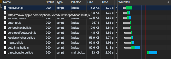
The last row – three.bundle.built.js is a compressed, ready for use version of three.js – a library of tools to create complex 3D graphics on the web page. It’s found in a variety of places, for things like data visualisation, aesthetic videos, product configurators and various video games. It’s a powerful tool, and it’s no surprise it’s shown up here.
The actual 3D element (and the last part of this section) happens after the black bars have reduced the visible image area down to a tiny strip. The strip is then revealed to be the narrow edge of a flat gridded plane. This is what three.js is doing – drawing a simple flat box with a texture on it, which animates with the users’ scroll.
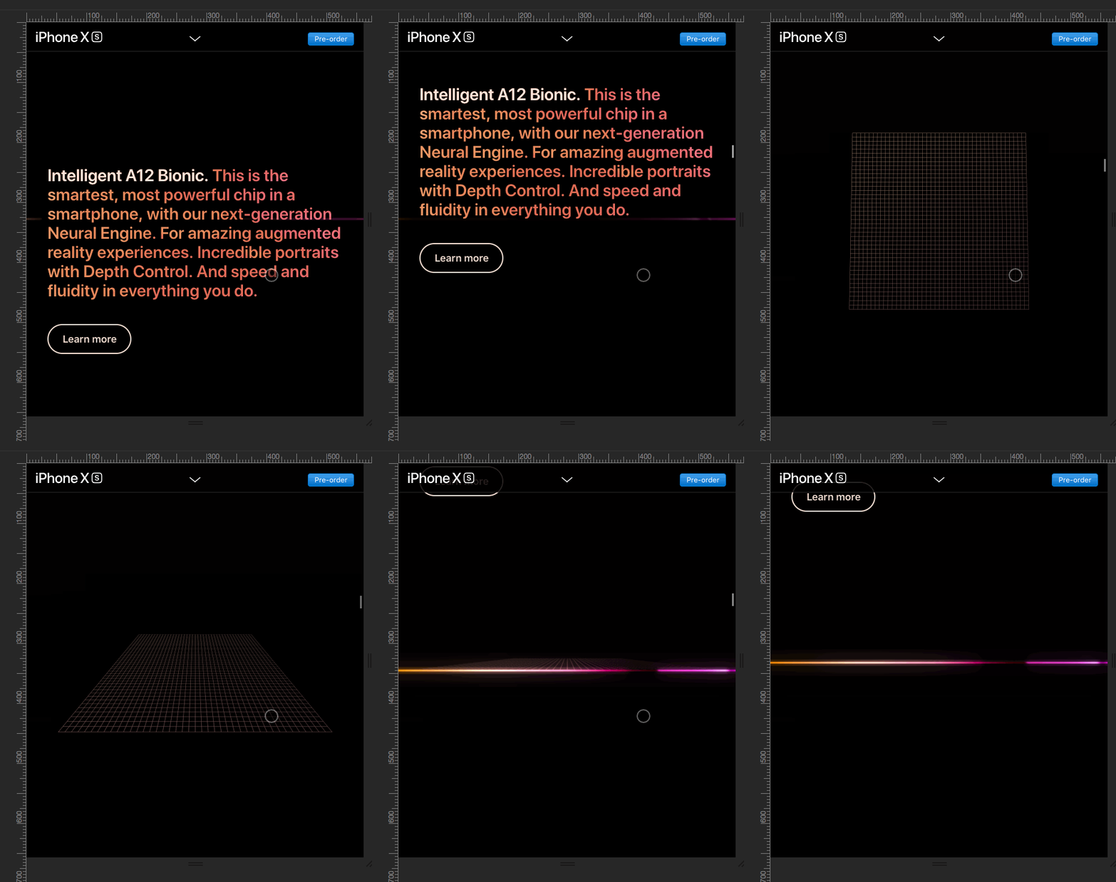
Once the box is rotated around to ‘face’ the viewport, regular html elements are then superimposed on top. Each of the A12 Bionic components has a data-order tag, which is used to determine the order in which they’re faded in. It’s a relatively simple effect, coupled with something much more complicated to have a really noticeable impact.
… Continues through the gallery
The first image in this gallery section works similarly to a standard background image you’d see on other sites. It’s got a fixed position, so the background itself stays put while other elements move.
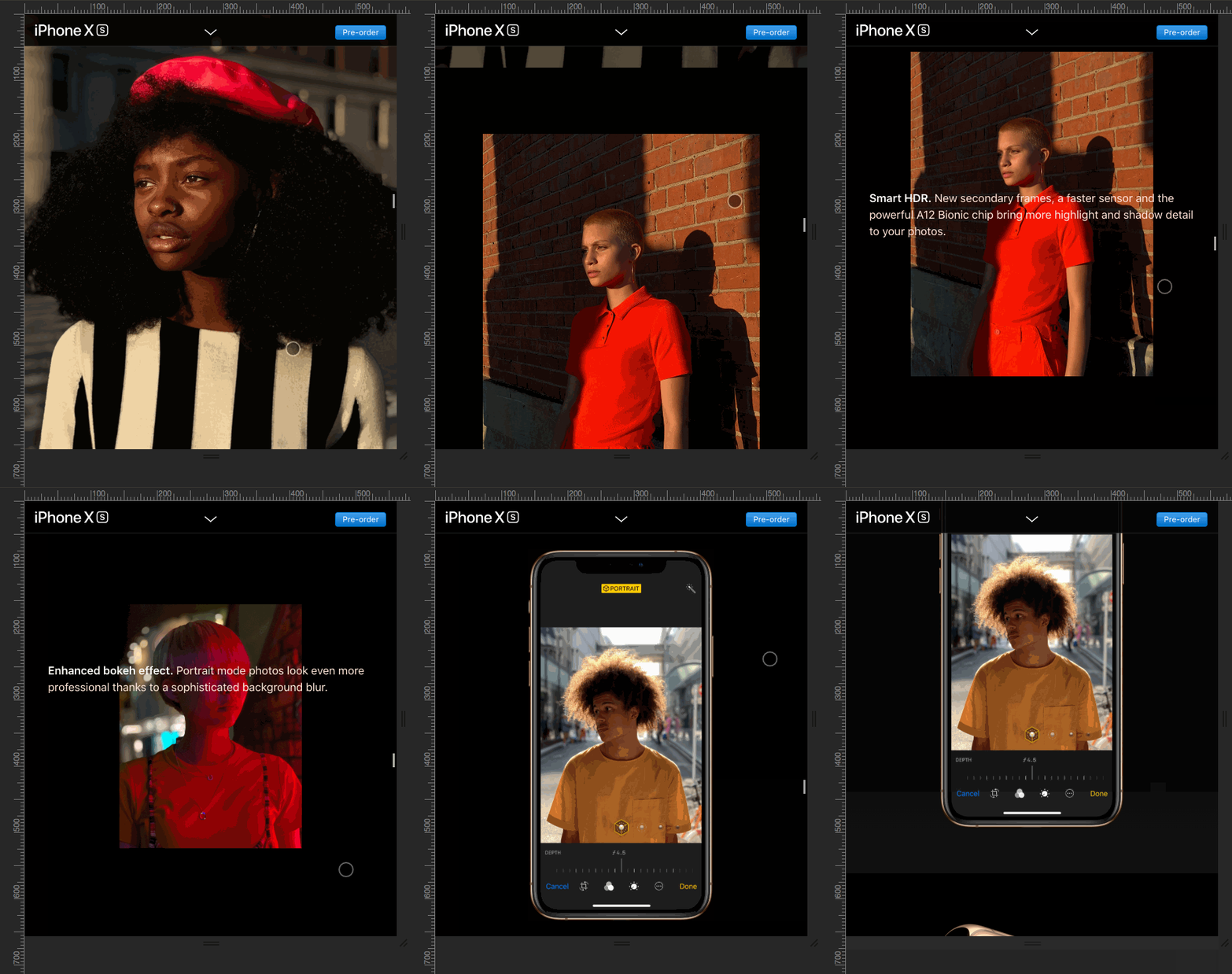
Starting with the second image, however, there’s more happening. Similar transform and opacity rules as those in the first animations are used to scale images and fade them out as certain scroll points are reached. Compared to the previous section, this is simple. Much of the effect of this section is due to the actual design choices made – the photos becoming sequentially smaller before being eventually placed inside the phone display give the section depth and context.
The first few photos also feature a warm colour palette (note the red beret in the first photo, dress in the second, and the neon lighting in the fourth) to tie them together.
After the gallery, the specs for the camera appear. On desktop, or larger tablet screens, there’s another animation not dissimilar to the first animated area – it’s changes to the position and opacity of these elements. The same properties are changed, just with different content and values.
… all the way into the gift shop
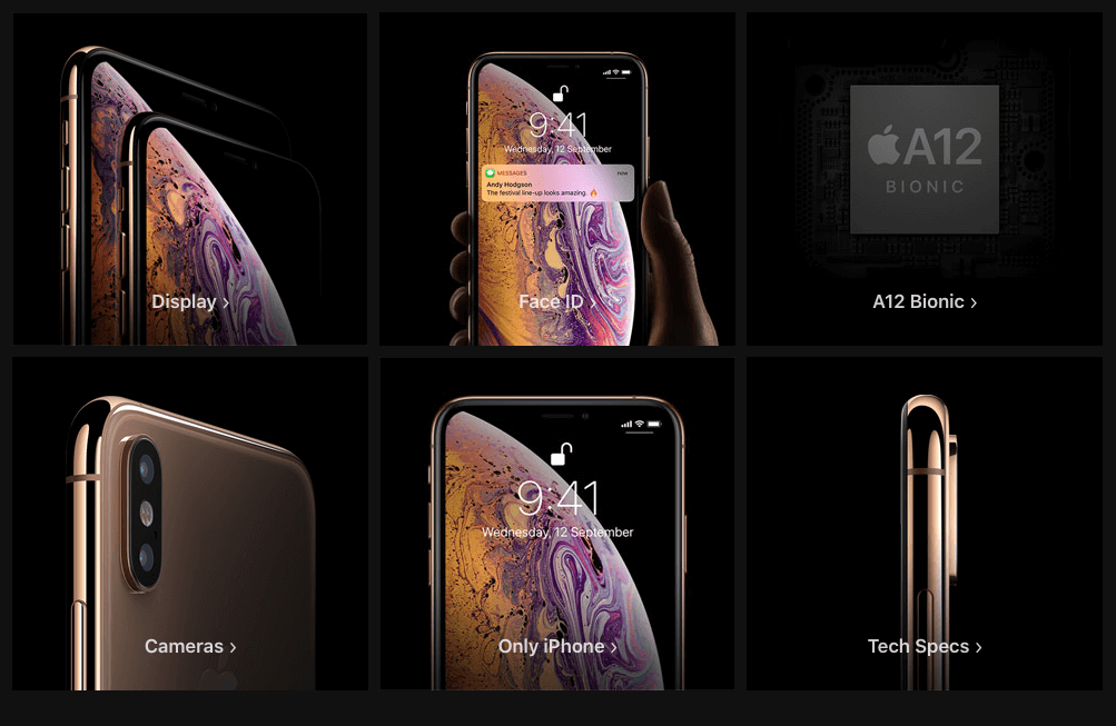
After this section, the rest of the page is largely traditional web content, with some more headings, grids, buttons and a few links to purchase the iPhone. This area features a re-cap of features, as well as options for finance, the app store app and delivery information. Most of the previous parts of the site were all about the product- they leave it towards the very end to before detailing any prices or purchase info. This is a simple method to encourage purchases – your audience is already sold the product before they see the pricetag.
The takeaway.
So overall, there’s a few key things we can learn from this page.
First and foremost I’d stress the importance of responsive design, where any device can view the page and receive an equally rich experience. Throughout the page, there’s only a few well-considered compromises where the experience is changed for a handheld device. No crucial parts of the page are removed, it’s simply a different experience for certain sections.
Secondly, the actual aesthetic of the site is responsible for most of the impact. No one graphic by itself is particularly complex. It’s the consistency and choices around them that make this impressive. Most of the images are photos (or, likely, 3D renders) of the phone with custom or hand-picked photos displayed on the screen. All parts of the page are related to the actual product lineup – even the black background is likely chosen to emphasise the OLED screen’s deep blacks.
Animation is the other key part of this site. Most of the animations are fairly simple (excluding the subtle 3D effects they’ve used in the middle of the page) movements and fades. This is a good lesson for anyone designing a site, or having one designed – less is more with animation. Realistically, there’s two sorts of animations on the web – those that require your full attention and those that you should barely notice. This site marries both together.
On a performative, technological level, the site uses some very modern stuff, (three.js, an intersection observer to measure scrolling distance and more than a few clever responsive design tricks), but it’s underpinned by solid, standard web practices. Many of the techniques used on this page appear across our own works and on this very site. None of what’s used is magic – it’s simply used in a smart, consistent way.


